A great photography website should do more than display beautiful images—it should create an experience that makes people want to keep exploring. These photography websites show how photographers can use layout, typography, navigation, animation, and storytelling to turn a portfolio into a memorable digital presence.
5 Photography Websites to Inspire Your Next Portfolio
When looking for photography website inspiration, it is easy to focus only on the photographs themselves. But the strongest photography portfolio websites make the website part of the creative work.
The examples below take very different approaches to photography website design, from immersive editorial layouts to deliberately minimal galleries.
If you want a step-by-step process for turning inspiration like this into your own site, see our guide on how to build a professional photography portfolio.
1. Dondre Green — Photography Meets Storytelling
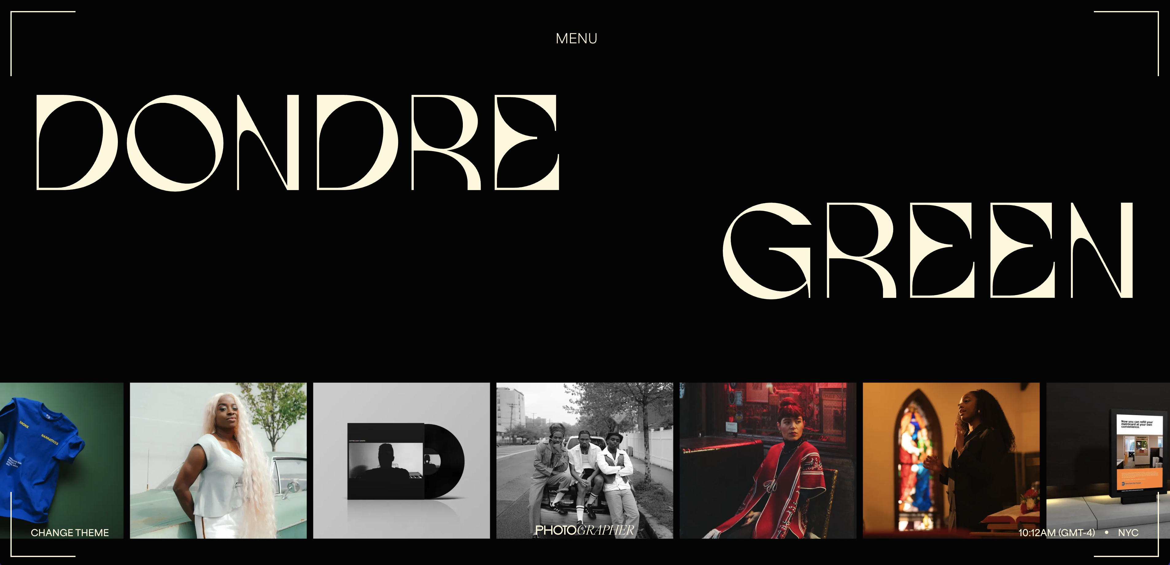
Dondre Green's website is a strong example of how a photographer can build a visual identity that goes beyond a traditional portfolio grid.
The site immediately establishes Green as both an art director and photographer, then uses a compact navigation system built around Info, Work, and Stories. His Work section is particularly effective because it is not limited to one type of photography. Visitors can explore portraits, interiors, places, short films, and art direction projects.
Why the design works
The biggest strength is editorial storytelling.
Instead of presenting hundreds of photographs as a disconnected gallery, the site organizes the work into recognizable projects and visual stories. That gives visitors context and encourages them to explore further.
The interface is also intentionally understated. Large visual areas, strong typography, limited navigation, and generous whitespace allow the photography to remain the dominant element.
Another smart detail is the site's ability to move between different creative disciplines without feeling confusing. Photography, art direction, creative direction, graphic design, and film all live within the same visual system.
For photographers working across several disciplines, this is an excellent lesson: your portfolio does not have to look like a gallery. It can feel like an editorial publication or creative studio.
The takeaway
Use your website to communicate how you think, not just what you photograph.
A strong photography portfolio should answer more than “What do your images look like?” It should also communicate your style, interests, experience, and the type of clients or projects you want to attract.
2. CREAMU — Let the Photography Do the Talking
The CREAMU photography website takes almost the opposite approach.
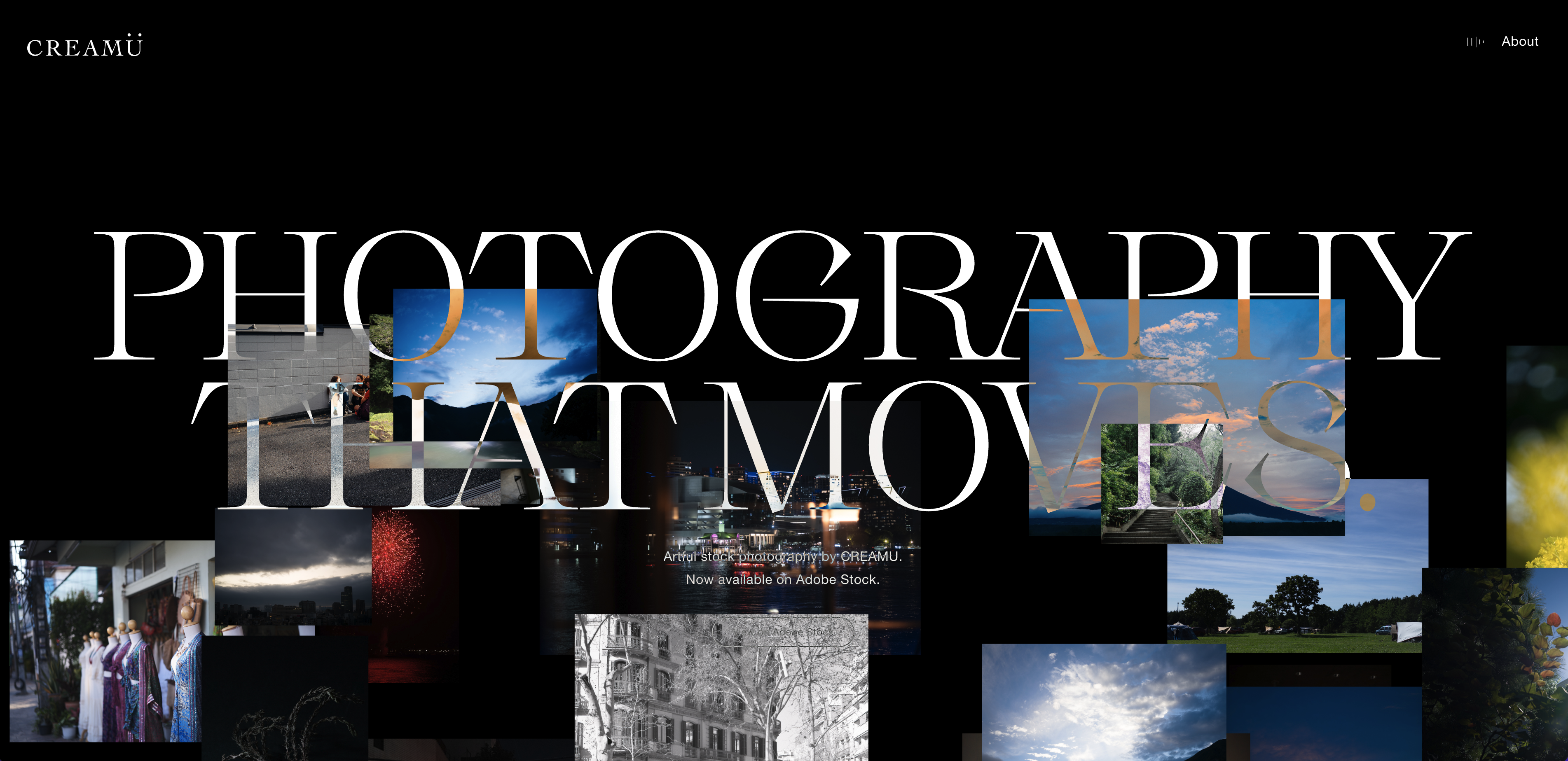
Rather than surrounding the images with extensive copy, branding, and complex navigation, the site creates an extremely focused presentation around the photography itself. The page positions the work as artful stock photography by CREAMU, with a direct connection to Adobe Stock.
Why the design works
The site understands something fundamental about photography websites:
Sometimes the best design is less design.
When the work is visually strong, the interface should not compete with it.
The minimal structure creates a gallery-like experience where the visitor's attention stays on the images. There is very little friction between landing on the site and discovering the photographer's work.
This approach can work particularly well for photographers whose primary selling point is the visual quality of their imagery.
It is also a useful reminder that a photography website does not need dozens of sections to be effective. A simple portfolio, a concise introduction, and a clear path to contact can be enough.
The takeaway
Your website should support your photography, not compete with it.
If your images already have a strong visual language, consider simplifying everything around them: navigation, copy, colors, animations, and page structure.
3. Photoyoshi — A Portfolio Built Around Categories
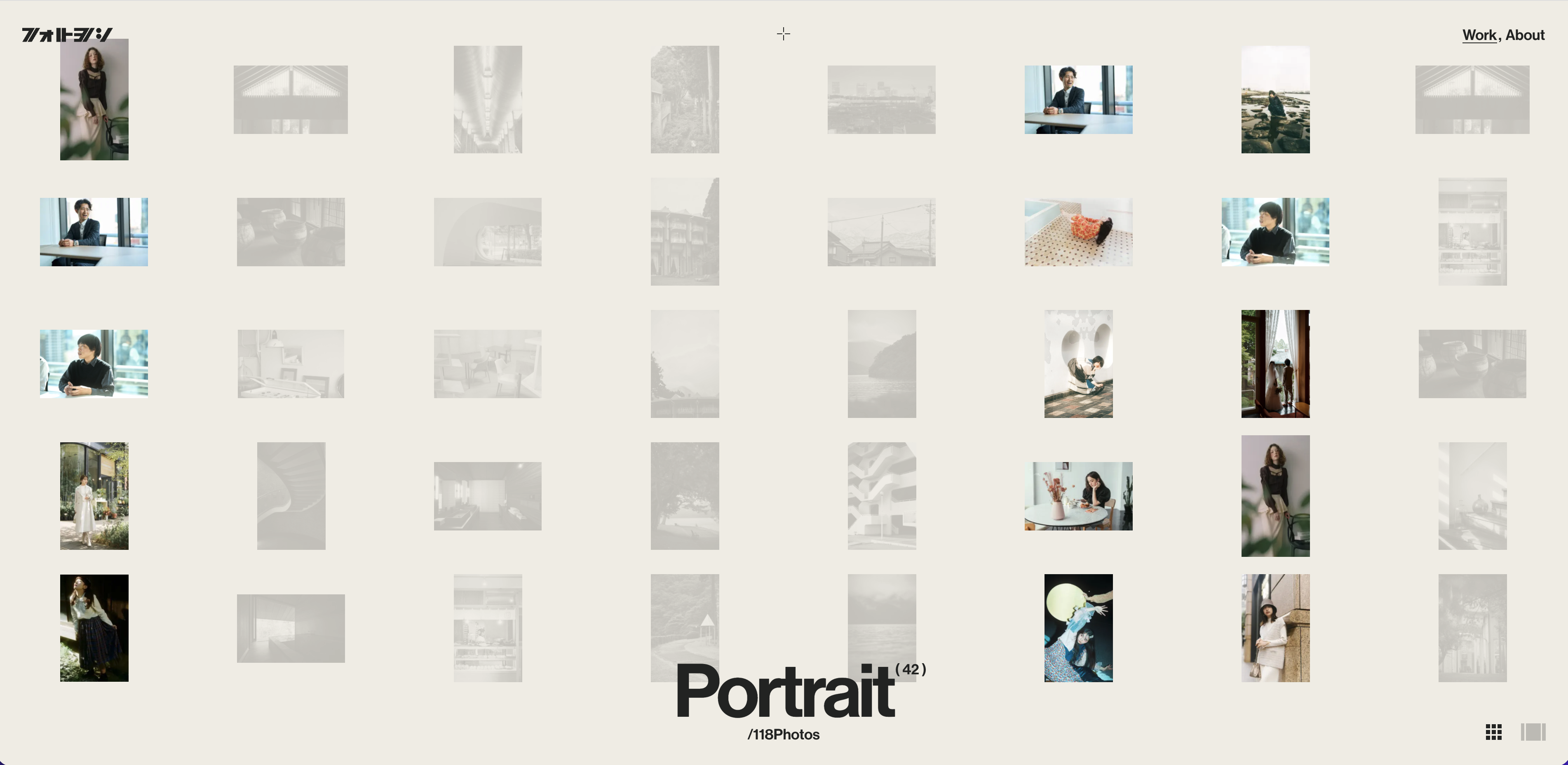
Photoyoshi, the portfolio of Japan-based photographer Takamitsu Motoyoshi, takes a more structured approach to presenting a large body of work.
The website organizes the photography into categories including Lifestyle, Portrait, and Landscape, with the portfolio showing the scale of the collection through image counts.
Why the design works
The site demonstrates how organization can become part of the visual experience.
Rather than showing every photograph in one endless stream, the work is separated into distinct categories. This makes the portfolio easier to explore while still maintaining a very minimal visual identity.
The gallery interface also creates an interesting sense of movement. Some images are emphasized while others recede into the background, creating hierarchy without relying on heavy UI elements.
For photographers with a large archive, this is particularly useful inspiration.
A good photography website should make it easy for visitors to answer:
What type of photography does this person specialize in?
What projects can I explore?
Where should I start?
Photoyoshi addresses those questions without filling the interface with unnecessary information.
The takeaway
If your portfolio contains many different styles or genres, use categories to create structure.
A well-organized photography portfolio can feel more curated and intentional than simply uploading every image you have produced.
4. Kenichi Aikawa — Minimalism With a Strong First Impression
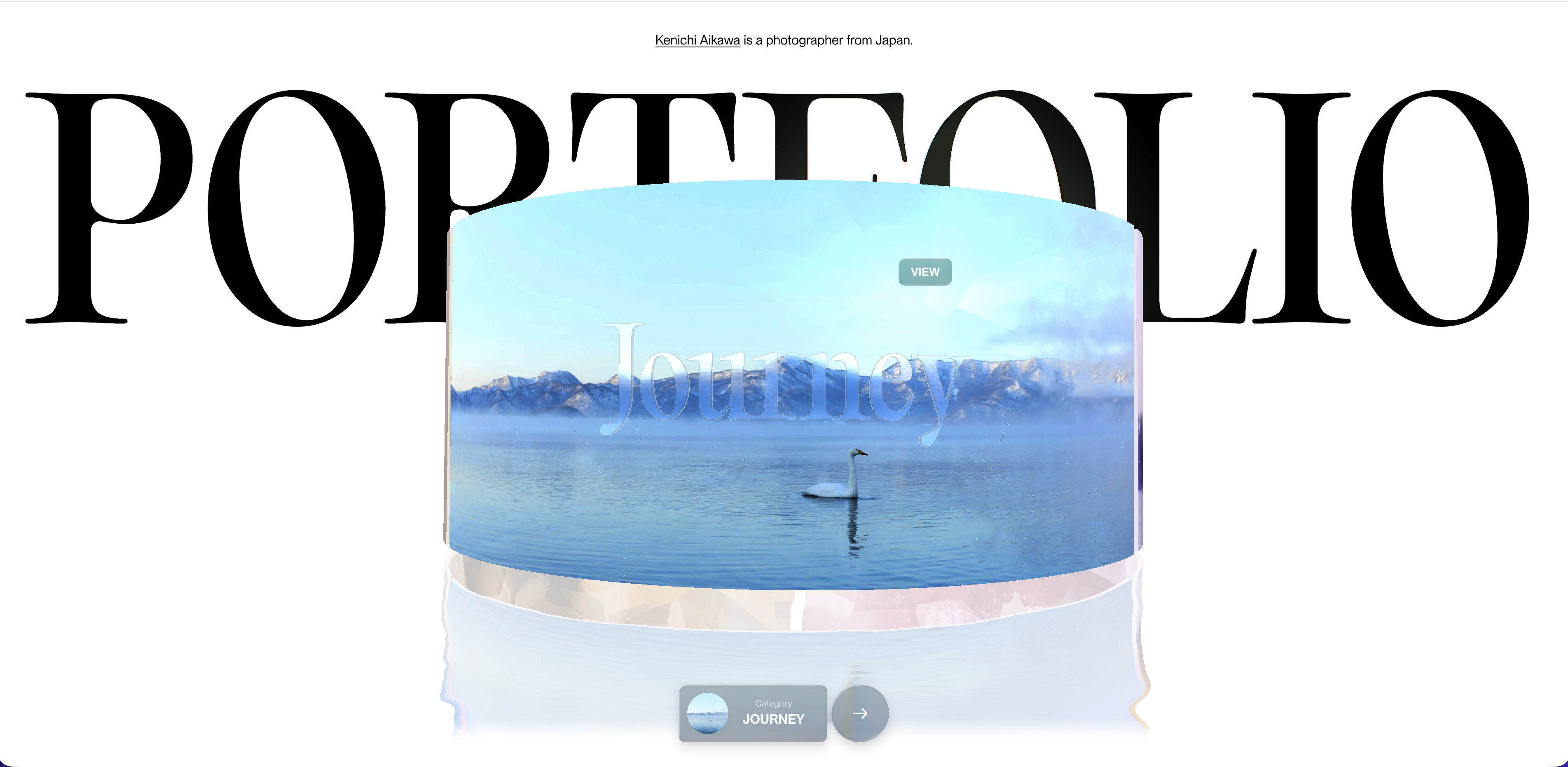
Kenichi Aikawa's website is an excellent example of how little you sometimes need to create a strong photography portfolio.
The homepage identifies Aikawa immediately as a photographer and gives visitors a small number of clear directions: Work, Fashion, Journey, and Mode.
The visual presentation is deliberately sparse, with typography and photography given plenty of room to breathe.
Why the design works
The homepage feels more like the opening page of a fashion editorial than a conventional photographer portfolio.
That distinction matters.
Instead of attempting to show everything immediately, the design creates curiosity. The visitor sees the photographer's name, a carefully selected image, and a clear invitation to continue.
The approach demonstrates the value of visual hierarchy in photography website design.
Not every image needs to appear above the fold. Not every service needs to be explained immediately. The homepage's job is to create enough interest for someone to explore deeper into the work.
The site has also been recognized by Awwwards, with the portfolio described as a refined presentation of Aikawa's work across fashion, portrait, lifestyle, food, and corporate photography.
The takeaway
Think of your homepage as the cover of your portfolio.
Choose one strong visual direction rather than trying to show everything at once.
5. Detroit — Turn a Portfolio Into a Creative World
Detroit is technically a production house rather than an individual photographer's portfolio, but it is worth including because it demonstrates where photography websites can go when the website itself becomes part of the brand experience.
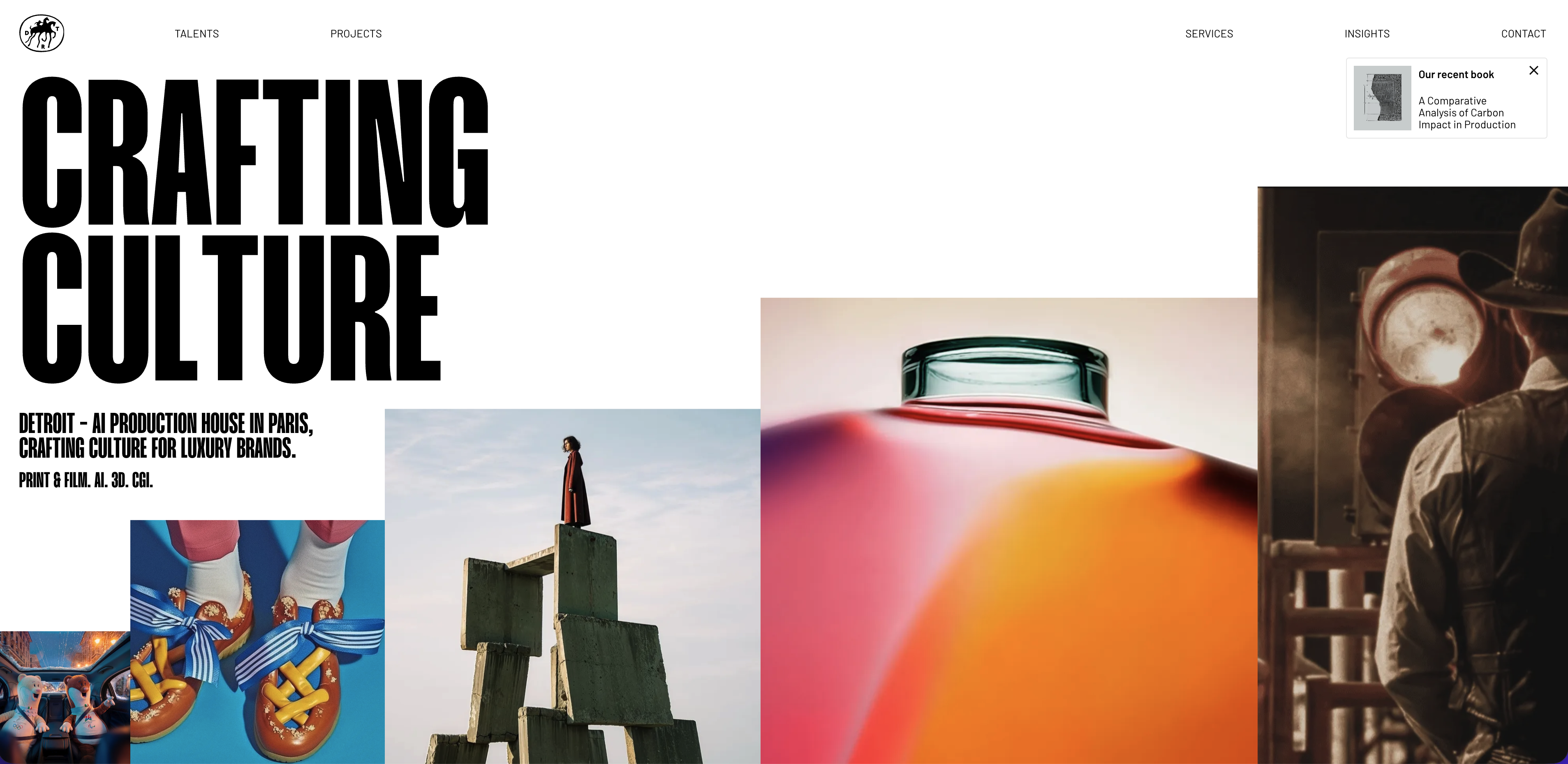
The Paris-based production house describes itself as an AI production house for luxury brands, working across print, film, AI, 3D, and CGI. Its site combines projects, talent, services, insights, and contact into a highly visual experience.
Why the design works
Detroit understands that creative clients are not simply evaluating individual images.
They are evaluating taste.
The site therefore presents the entire organization as a creative world. Projects become visual case studies. Talent becomes part of the brand. Services provide context. Insights reinforce expertise.
That approach can be especially powerful for commercial, fashion, advertising, editorial, and production photographers.
Your portfolio does not have to stop at “here are my photos.”
It can communicate:
This is the kind of world my work belongs in.
The takeaway
Your website can become part of your positioning.
If you want to work with luxury brands, fashion companies, agencies, magazines, or commercial clients, the design of your website should reinforce that positioning before a potential client ever contacts you.
What These Photography Websites Have in Common
Although these examples look very different, they share several principles that make them effective photography websites.
1. The photography comes first
Every strong portfolio makes the work the main visual element.
The interface exists to help visitors discover the photography rather than distract them from it.
2. The design has a point of view
The websites do not all use the same trendy layout.
Some are minimal. Some are editorial. Some are experimental. Some are highly structured.
What matters is that the website feels connected to the photographer's creative identity.
3. Navigation is intentional
The best photography portfolio websites make it obvious where visitors can go next.
Whether that means Work, About, Fashion, Stories, Portraits, or Projects, the navigation reflects the photographer's actual practice.
4. The work is curated
A portfolio is not an archive.
Showing your 300 favorite images does not necessarily create a stronger impression than showing 30 exceptional ones.
The best photography websites use categories, projects, and sequencing to guide the viewer.
5. The website sells more than photography
For professional photographers, the website has another job: turning attention into opportunity.
That means the site should eventually answer practical questions too.
- Who are you?
- Where are you based?
- What type of photography do you offer?
- Who have you worked with?
- How can someone contact you?
A beautiful portfolio without a clear next step can leave business opportunities on the table.
For the full process of turning inspiration into a client-generating site, see our guide on how to create a photography website that attracts clients.
You Don't Need to Be a Developer to Build a Photography Website
Looking at websites like these can make photography website design seem intimidating.
It is easy to assume that a portfolio with custom layouts, sophisticated typography, image transitions, and editorial-style interactions requires a designer or developer to build.
That is no longer necessarily the case.
Today, photographers can take much more control over the process themselves.
Instead of hiring someone to translate their creative direction into a website, photographers can start with a professional design system, customize the content and visuals, and publish their website themselves.
That is where tools like Modulify can make the process significantly easier.
Build and Publish Your Photography Website With Modulify
Modulify is an AI-powered website builder designed to help people create, customize, and publish websites without needing to work across multiple tools.
For photographers, that changes the workflow.
Instead of moving between a design tool, website builder, content tool, image platform, and SEO tools, you can bring much more of the process into one place.
You can start from a professionally designed template, customize the layout and visual direction, replace the imagery with your own work, generate or refine website content, optimize pages for search, and publish the finished website.
Explore Modulify photography templates
Start With a Photography Website Template
Starting from a blank canvas can be one of the hardest parts of building a website.
A template gives you somewhere to begin.
Modulify provides a collection of website templates covering different visual styles, industries, and use cases. Photographers can use those designs as a starting point and then adapt them around their own portfolio, brand, photography style, and audience.
That means your photography website does not have to look like everyone else's.
You can start with the structure and make the final experience your own.
This is particularly useful when creating:
Photography portfolio websites
Wedding photography websites
Portrait photography websites
Commercial photography websites
Fashion photography websites
Lifestyle photography websites
Real estate photography websites
Personal photographer websites
The goal is not simply to find a template that looks good.
It is to find a structure that gives your photography the right context.
Ready to Build Your Photography Website?
Take the inspiration from the examples above, find a visual direction that feels like you, and start building from there.
Your next photography website does not have to look like everyone else's.
It just needs to look like your work.