
An interior design portfolio website has one job: make a stranger feel your work before they read a single word about you. The best ones do it in the first three seconds, with photography, pacing, and restraint. We looked at award-recognized studio sites from London to Miami and picked five that get it right, then broke down exactly what makes each one work.
What makes an interior design portfolio website good?
A good interior design site gets out of the way of the photography. Full-bleed imagery, minimal chrome, real project names instead of generic labels, and a navigation structure that lets a visitor browse by room type or project rather than scrolling forever. The best ones also load fast despite huge images, and every project page ends with a way to start a conversation, not just a phone number buried in a footer.
1. Studio Ashby — Cinematic Minimalism, London
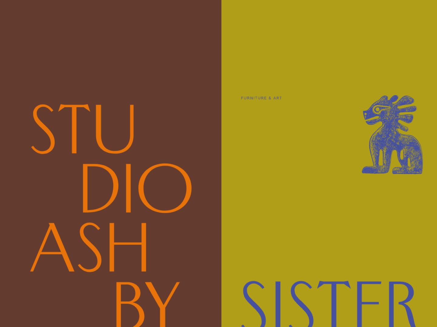
Studio Ashby is Sophie Ashby's London studio, and the homepage is built around a single idea: let the photography fill the screen and say almost nothing over it. Navigation is stripped to Projects, About, Contact, and Store, with the "Store" pointing to Sister, the studio's own furniture and homewares line sold as a companion to the design work.
Why the design works: There's no hero copy competing with the imagery, no carousel, no stacked trust badges. The restraint itself signals confidence: a studio this established doesn't need to over-explain, it just needs to show the room. Linking out to a retail arm (Sister) also turns portfolio visitors into a second revenue stream without cluttering the main navigation.
The takeaway: Fewer navigation items and less on-page copy can read as more established, not less finished. If your photography is strong, let it occupy the full frame and cut every word that isn't doing real work.
2. Beata Heuman — Maximalist and Unmistakable, London
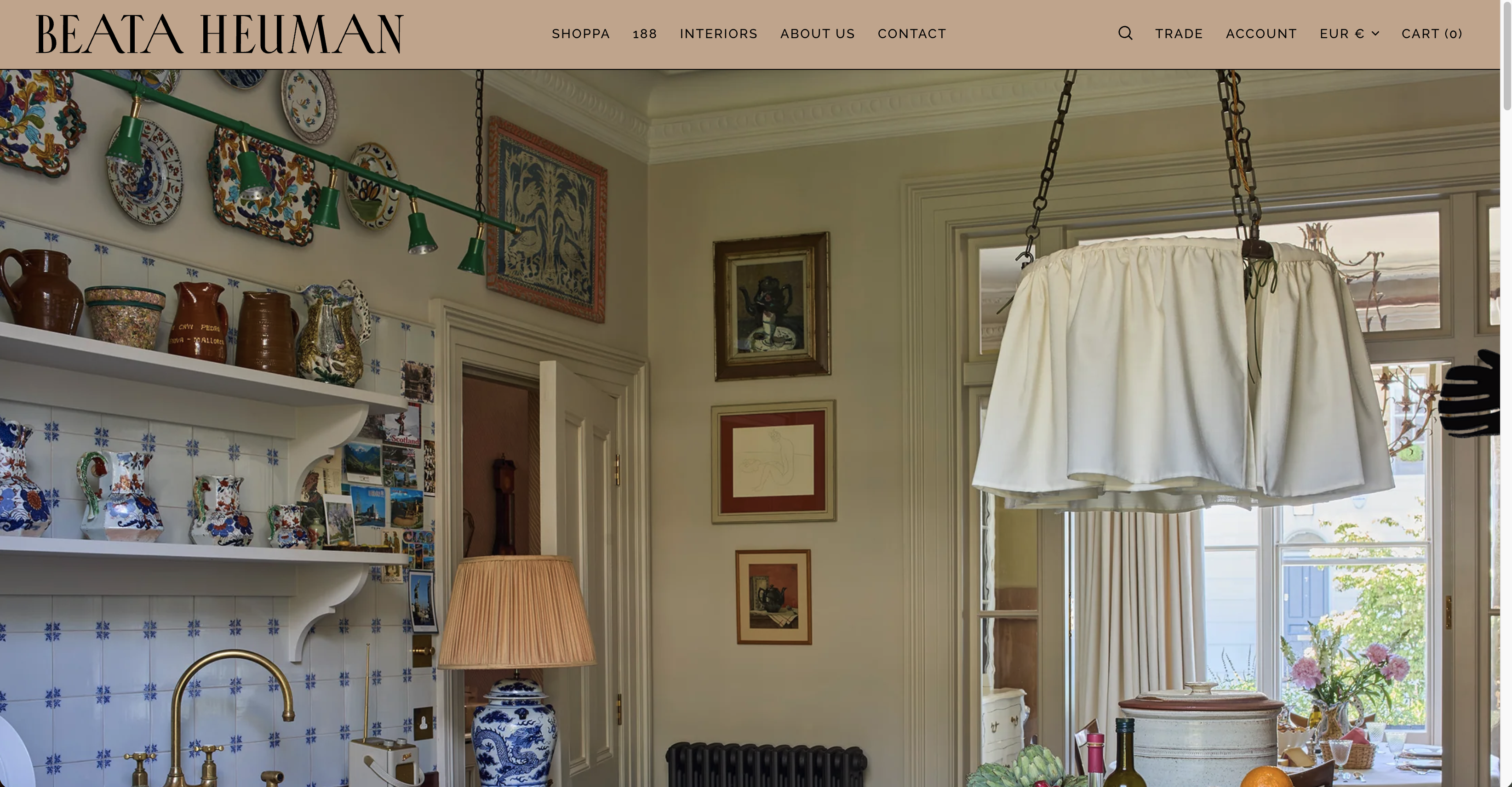
Beata Heuman takes the opposite approach from a minimalist site and still wins: the homepage opens on a playful, illustrated figure built from the studio's own product photography, stamped with a bold red logo mark. Navigation splits cleanly into "Shoppa" (fabrics, wallpaper, lighting, furniture, homewares), the "188" studio showroom, an interiors portfolio, and press that includes a CNN feature on "Women redefining luxury" and a BBC Maestro course.
Why the design works: Most portfolio sites default to restraint because it feels safer. Beata Heuman's site proves a distinctive visual identity — a recognizable color, a signature illustration style, a named product shop — differentiates just as effectively as white space does, as long as it's applied consistently across every page. The press mentions aren't a separate "As Seen In" strip; they're woven into the same navigation as the work.
The takeaway: A strong, consistent visual signature (a color, a mark, an illustration style) is a legitimate alternative to minimalism, not a lesser choice. Pick one and repeat it everywhere, rather than landing somewhere generic in between.
3. Usher & Co — Award Credentials Up Front, UK & International
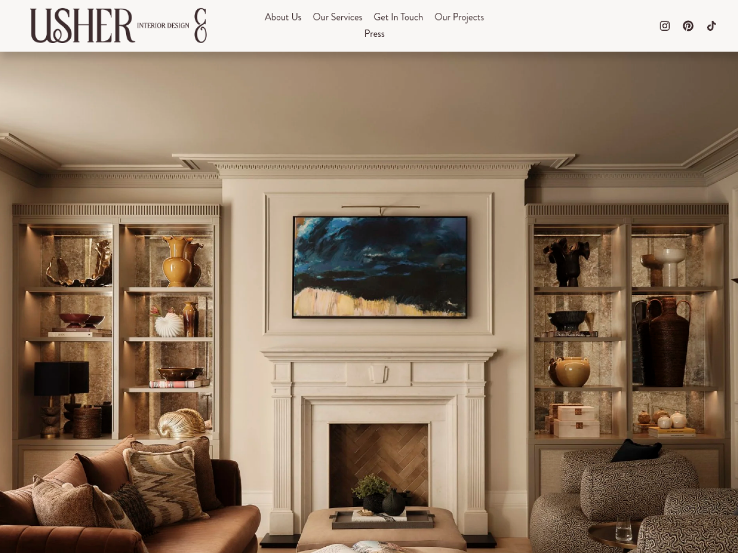
Usher & Co (formerly Rachel Usher Interior Design) describes itself plainly on the homepage as "a multi-award-winning high-end interior design practice," with an awards banner linking straight to the Society of British Interior Design. A rotating carousel of finished projects leads into three featured case studies — a London pied-à-terre, a Yorkshire architectural estate, and a Richmond family home — and the Projects dropdown splits work into UK, International, In Progress, and Press.
Why the design works: Splitting "In Progress" into its own category is the standout move: it shows the studio has a live pipeline of active clients, which is a subtler and more convincing trust signal than a testimonial quote. Putting the awards banner above the fold, rather than on an About page, front-loads the credibility a high-end client is looking for before they've scrolled once.
The takeaway: If you've won recognized industry awards, don't bury the badge on a Credentials page. And if you have active projects underway, a simple "In Progress" category does more to prove momentum than any amount of written copy.
4. Pepe Calderin Design — Filterable and Fast, Miami/New York
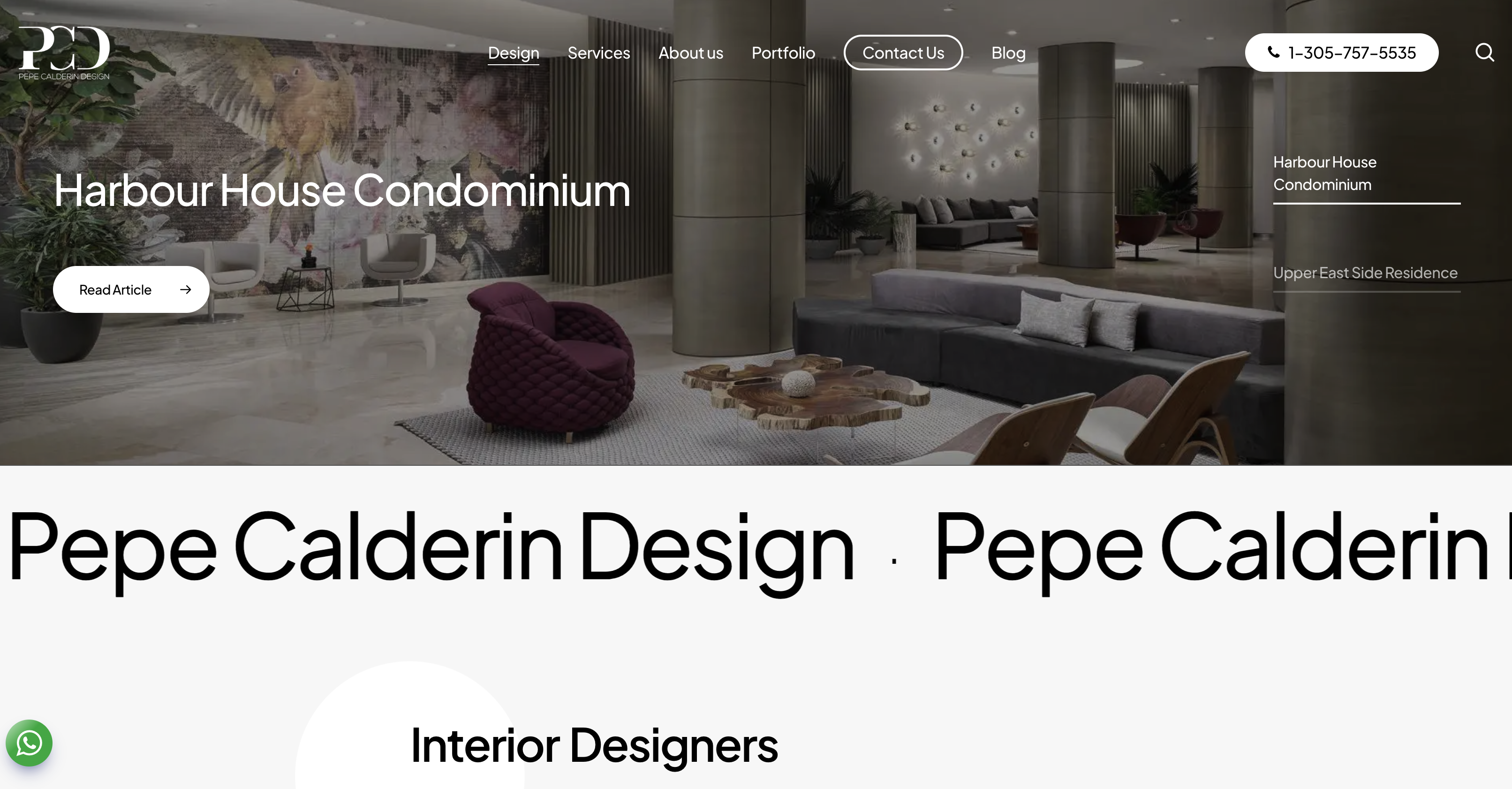
Pepe Calderin Design runs a minimalist, fixed-header site across offices in Miami, Naples, and New York, with a portfolio grid that lets visitors filter by All, Commercial, or Residential with one click. Testimonials sit directly beneath the hero, and the firm's phone number stays visible in the header at every scroll depth. The tagline is blunt: "A space has no boundaries, and has limitless possibilities."
Why the design works: The filterable grid is the standout feature here. Instead of forcing every visitor through the same undifferentiated wall of images, a commercial client can isolate commercial work in one tap. Combined with a persistently visible phone number, the site shortens the distance between "I like this" and "let me call."
The takeaway: If your portfolio spans more than one project type, a simple client-side filter is worth building. It costs little and it respects that a hotel developer and a homeowner are looking for completely different proof.
5. BAMO — Full-Bleed Storytelling, Multi-City
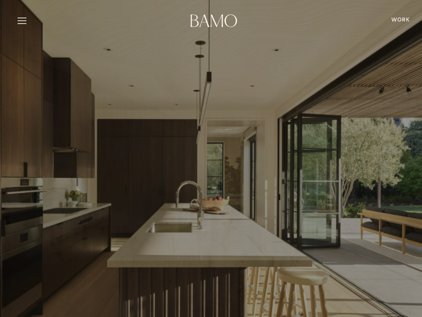
BAMO describes itself as "a collective of interior designers" with offices in San Francisco, Providence, Miami, New York, and Barcelona, and the homepage reads like an editorial spread: full-width photography paired with short, confident phrases ("Design collective," "Distinctive experiences"), organized into Private Residences, Hotels & Resorts, and Branded Residences. A team introduction section puts faces to the work before the footer's call to action.
Why the design works: BAMO trusts its photography enough to add almost no text over it. Short phrases do the framing; the images do the persuading. Splitting the portfolio into three clear categories — residential, hospitality, branded — lets an ultra-high-end client self-select into the right conversation immediately, without a generic "contact us for more info" catch-all.
The takeaway: Restraint is a design choice, not an absence of effort. If your photography is strong enough, minimal text and generous whitespace will outperform a page that tries to explain the work instead of showing it.
What these five have in common
Across very different visual identities and markets, the same patterns repeat: real project names instead of generic labels, categorization by project type or status rather than one long scroll, awards and press placed on the homepage instead of hidden on a separate page, and a persistent, low-friction way to get in touch. None of these sites rely on a slider carousel of stock photography or a generic hero. They all open on real, specific work.
Do you need a developer to build a site like this?
No. Every pattern above — named project pages, filterable galleries, an "In Progress" or press category, a persistent contact CTA — is a description, not a technical requirement. You don't need to hand-code a filter grid or hire an agency to get a homepage that leads with your best work and a clear way to reach you.
With Modulify, you describe the site you want in plain language — "a portfolio site for an interior designer, organized by residential and commercial, with a testimonial section and a contact form" — and get a real, working site back that you can keep refining with follow-up prompts. Add your own photography, keep the navigation as restrained as Studio Ashby's, or as distinctive as Beata Heuman's, and publish to a live URL when it's ready. The same patterns repeat across every visual, portfolio-driven trade, which is why we broke down architect portfolio sites and wedding photographer sites the same way.
The Modulify take
The best interior design portfolios aren't complicated. They're organized, they trust their photography, and they make it easy to say "I want that, let's talk." Start building your portfolio site with Modulify and get from description to a live page today.