
Updates
See what’s new in Modulify
We’ve rolled out a major upgrade to how images are generated in Modulify — bringing you custom visuals directly into the site creation process, with control over style, AI model selection, and credit usage.
AI Image Generation
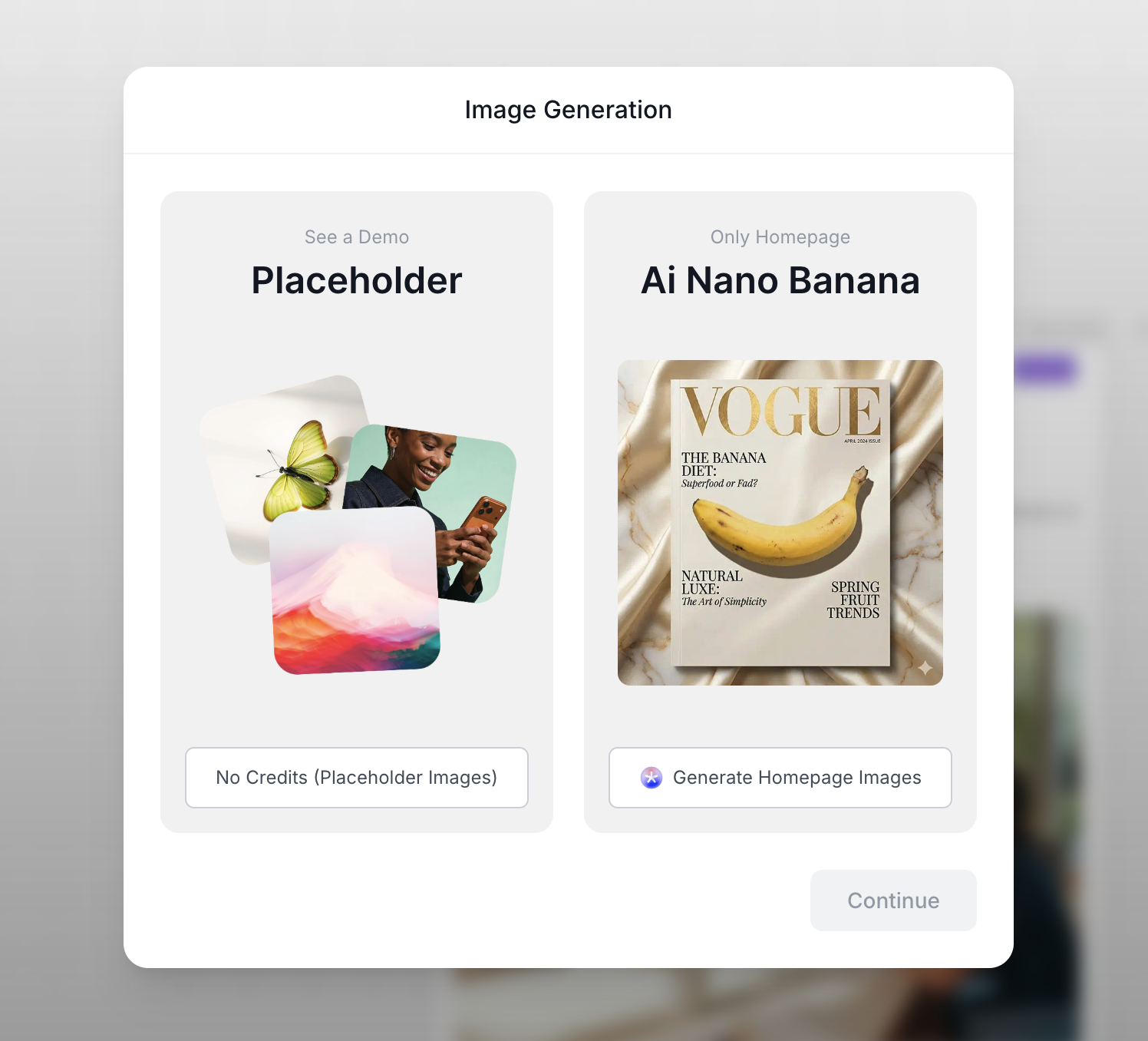
When you add your prompt and start generating a site, Modulify now offers you a choice between two options:
- Placeholder Images – Continue with demo visuals (no credits used)
- AI Generated Images – create custom visuals during site generation
This makes it easier to move fast in early drafts or go fully production-ready when needed.
Style-Based Image Generation
Before generating images, you can now select a visual style that matches your brand or layout:
- Illustration
- Photography
- Environment
- UI & Product
- Motion
- Professional
- Atmosphere, etc.
With curated presets like Modern, Airy, Editorial, Moody, and more, your images stay visually consistent across the site.
New Credits System
Alongside AI image generation, we’re introducing a credits system:
Here is how it works:
- Credits are only used when you generate AI images
- Placeholder images remain free
- Selecting AI images initially applies them to the homepage only— preserving credits for other pages you may add later.
- Different AI models, use different credit amount per image generated.
Choose your AI model:
- Gemini
- Nano Banana Pro
- GPT Image
No hidden, unexpected deductions — you stay in control.
New Styling Controls: Typography, Buttons, Cards, and Fields
January 21, 2026
Typography System
The new Typography System in Modulify gives designers full control over their text hierarchy from a single place. Instead of adjusting font sizes and spacing manually on every page, you can now define hero text, headings, and body typography globally. Any change you make instantly cascades across your entire design, ensuring consistency without repetitive work.
This upgrade dramatically improves how designers explore and test visual hierarchy. You can quickly experiment with different heading scales, spacing ratios, and font balances to see what works best for readability and brand expression.
Whether you’re designing a content-heavy site or a bold marketing landing page, typography changes no longer require redesigning components one by one.
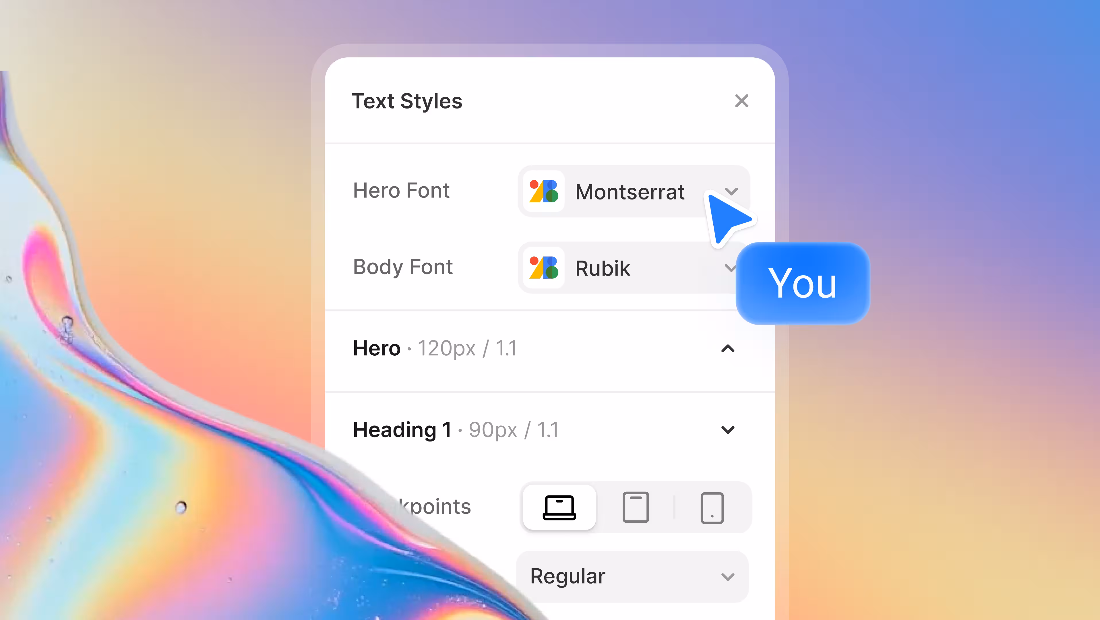
Once your typography feels right, your design is already structured for production. Modulify translates these typography decisions cleanly into Webflow-ready styles, reducing guesswork and preventing mismatches between design and implementation. What you design is what ships.
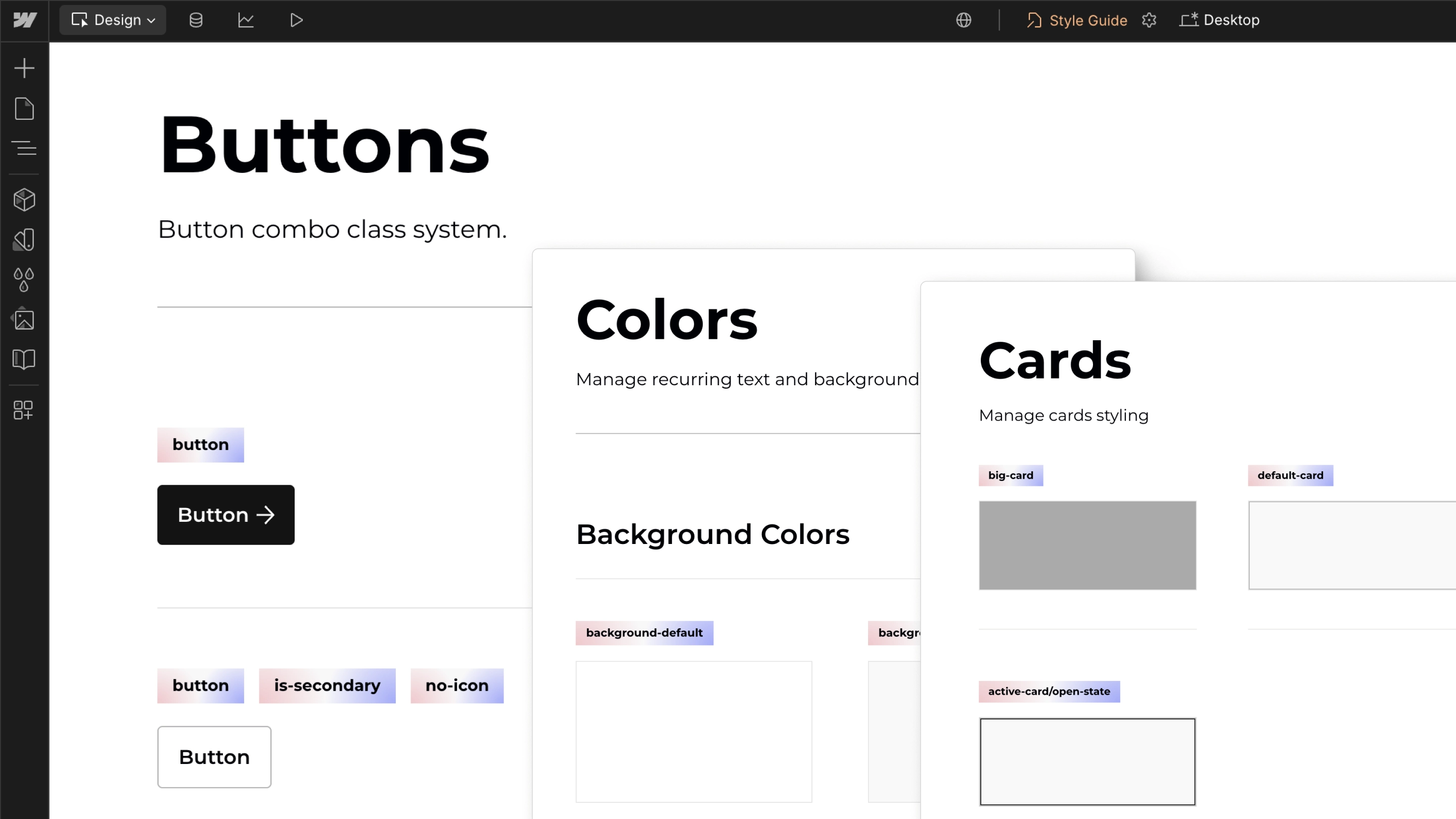
Button Styles
Buttons are one of the most reused components in any interface, and inconsistent button styles are one of the fastest ways to make a product feel unpolished. With Modulify’s new Button Styles, designers can define primary, secondary, and alternative button styles globally, including border radius, outlines, and icon behavior.
This allows designers to test different visual priorities quickly. You can explore how sharper or rounder buttons affect the feel of your interface, adjust emphasis between primary and secondary actions, and refine contrast for better accessibility and conversions—all without touching individual buttons. It’s fast iteration without visual chaos.
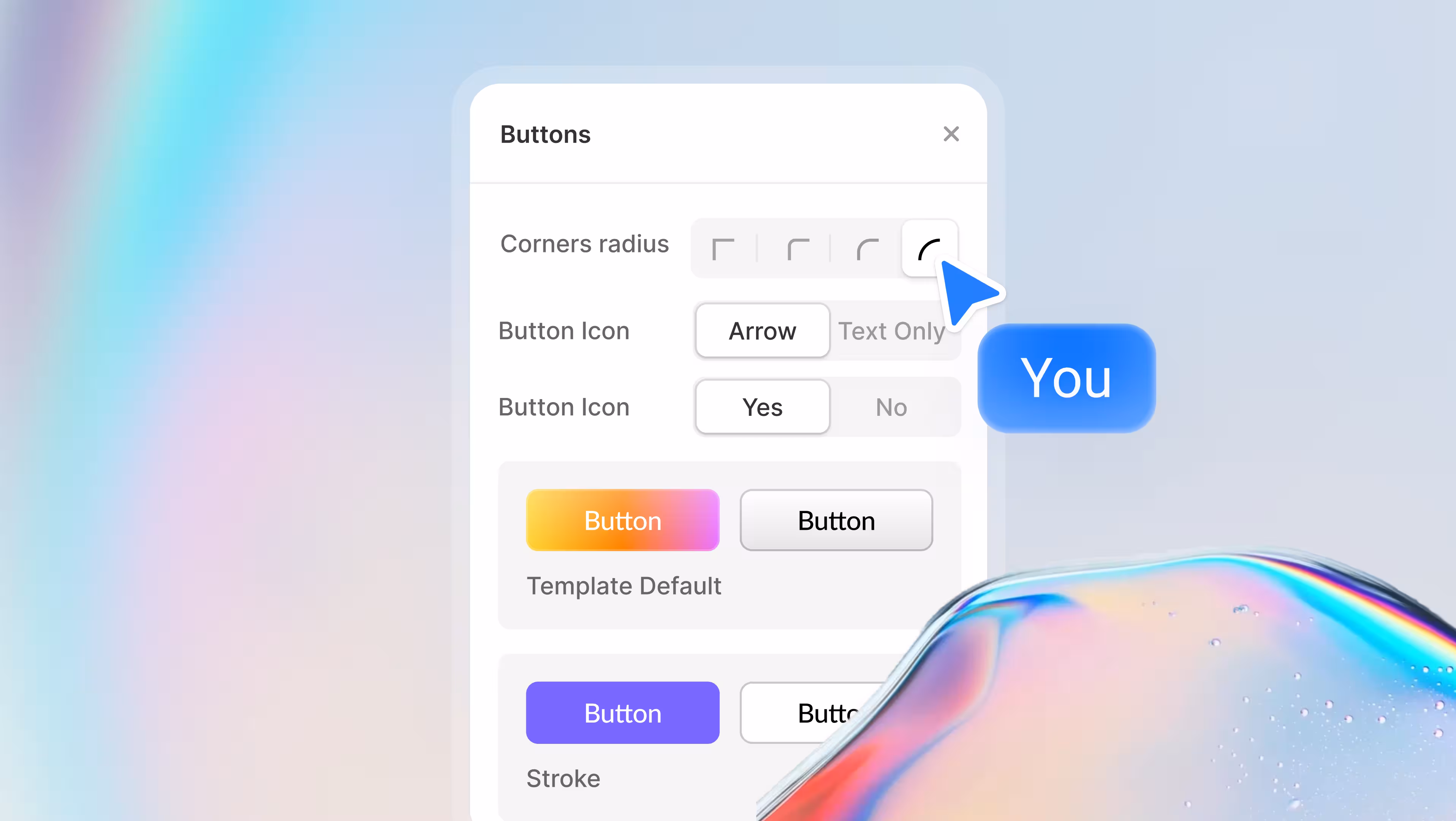
When the design is ready to move to Webflow, button styles are already standardized and predictable. Developers or no-code builders don’t need to reinterpret design intent—your button system is already defined, scalable, and production-ready.
Card Styles
Cards are foundational layout elements, and small inconsistencies in their styling can quietly undermine an otherwise strong design. Modulify’s Card Styles let designers control border radius variations globally, making it easy to define how structured, soft, or expressive a UI feels.
This feature empowers designers to experiment with visual personality at a system level. You can instantly switch between sharper enterprise-style cards or more rounded, friendly layouts to see which direction best supports the brand. These changes apply everywhere, helping designers evaluate the overall tone of the product instead of isolated components.
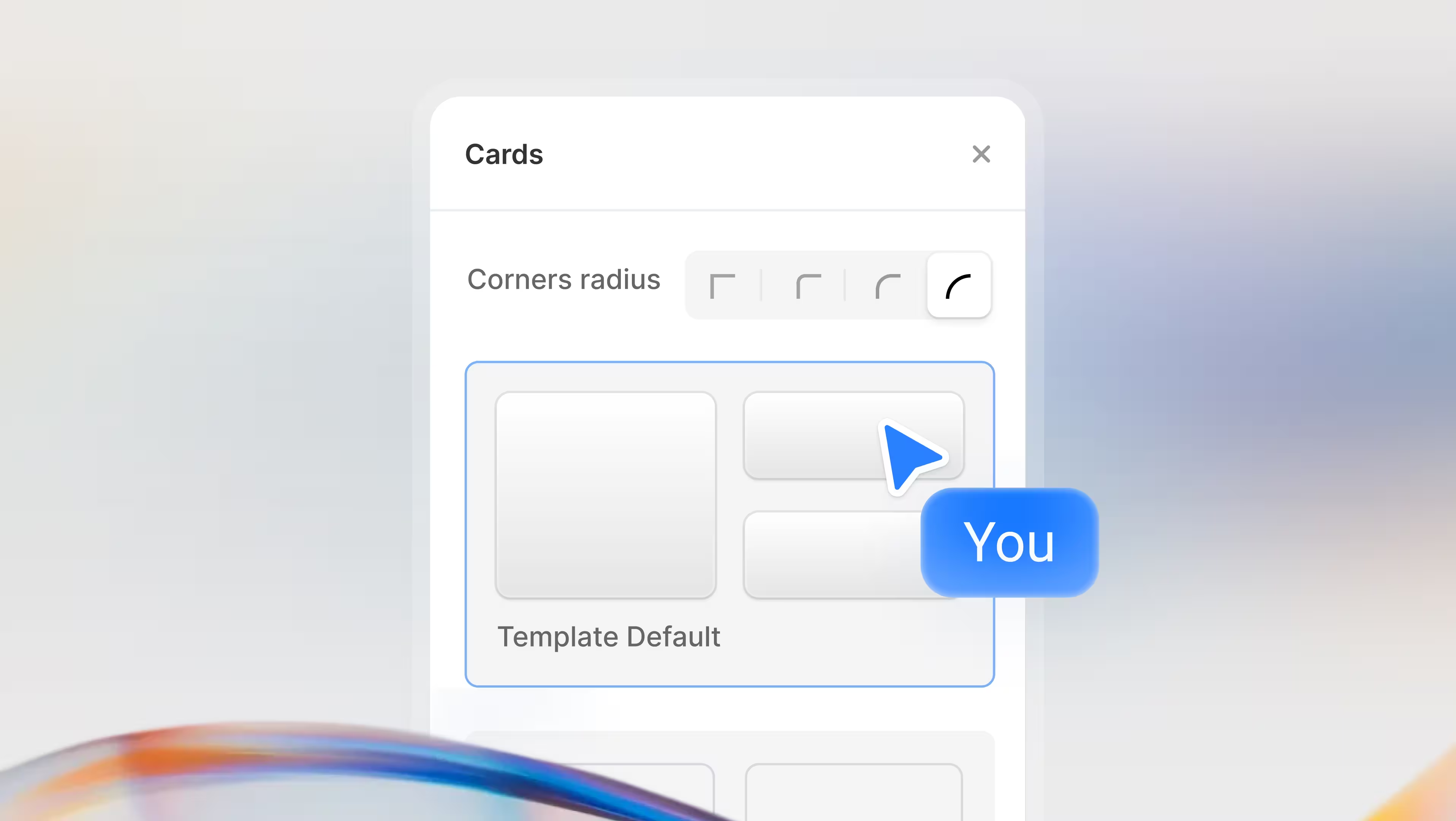
Because card styles are centralized, designs exported or rebuilt in Webflow remain visually aligned across sections and pages. No more mismatched containers or manual corrections—your layout system stays consistent from concept to live site.
Field Types
Forms are where UX mistakes are most visible, and inconsistent input styles quickly erode user trust. With the new Field Types in Modulify, designers can choose from multiple field styles and apply them across all inputs globally, ensuring forms look and behave consistently.
This makes it easier to test different form aesthetics and usability patterns. Designers can compare bordered inputs, minimal underline styles, or boxed fields to see what best suits the product’s audience—all without rebuilding forms. The result is faster iteration and fewer usability regressions.
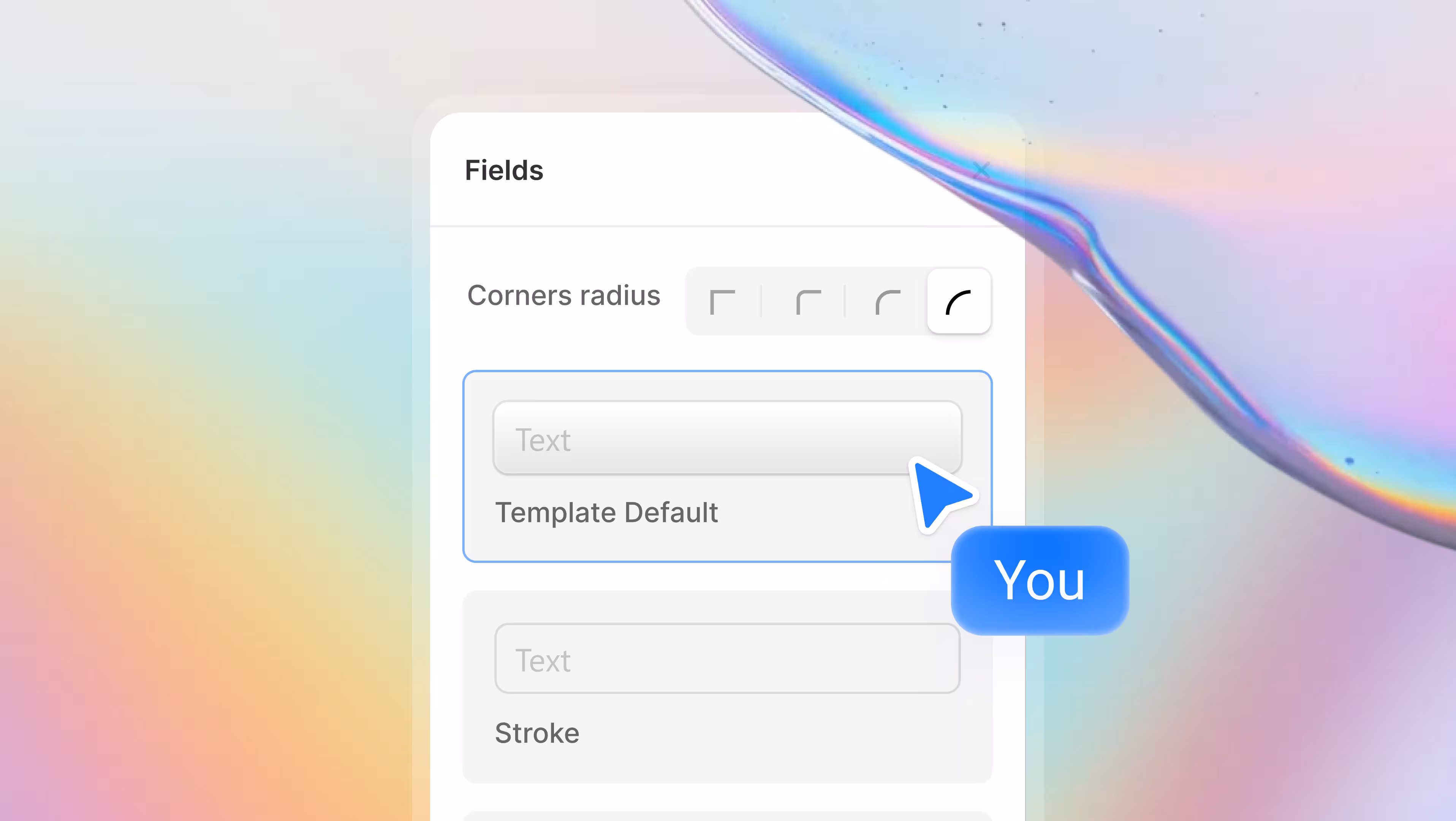
When preparing designs for Webflow, standardized field styles eliminate ambiguity. Inputs translate cleanly into reusable components, keeping forms accessible, predictable, and visually aligned with the rest of the interface—ready to publish without rework.
Try these and other great features!
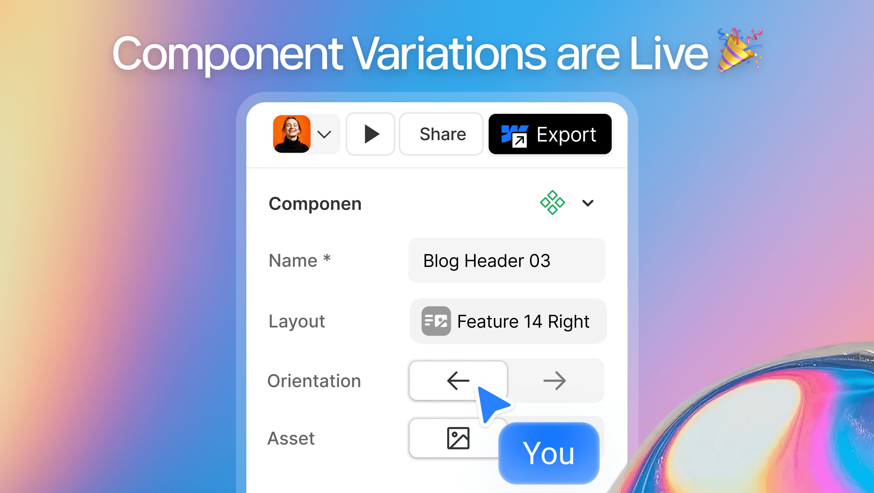
This feature allows you to switch between multiple layout, content, and structural variations using the same core component, all from a single settings panel.
Whether you’re a freelancer customizing a site for a client, an agency managing multiple layouts, or a startup iterating quickly, variations let you adapt components to different contexts without duplicating or rebuilding sections.
Instead of creating separate components for every layout change—such as switching orientation, adjusting columns, changing alignment, or swapping elements—you simply select a variation that fits the use case.
This keeps your Webflow project clean, consistent, and easy to maintain as it grows. Component Variations are ideal when designing responsive layouts, experimenting with different content structures, or reusing the same component across multiple pages with slight differences.
By working with variations instead of duplicates, designers move faster, reduce design debt, and maintain a strong, scalable design system across the entire site.
Introducing Workspaces & Seat Management — Built for Teams
December 16, 2025
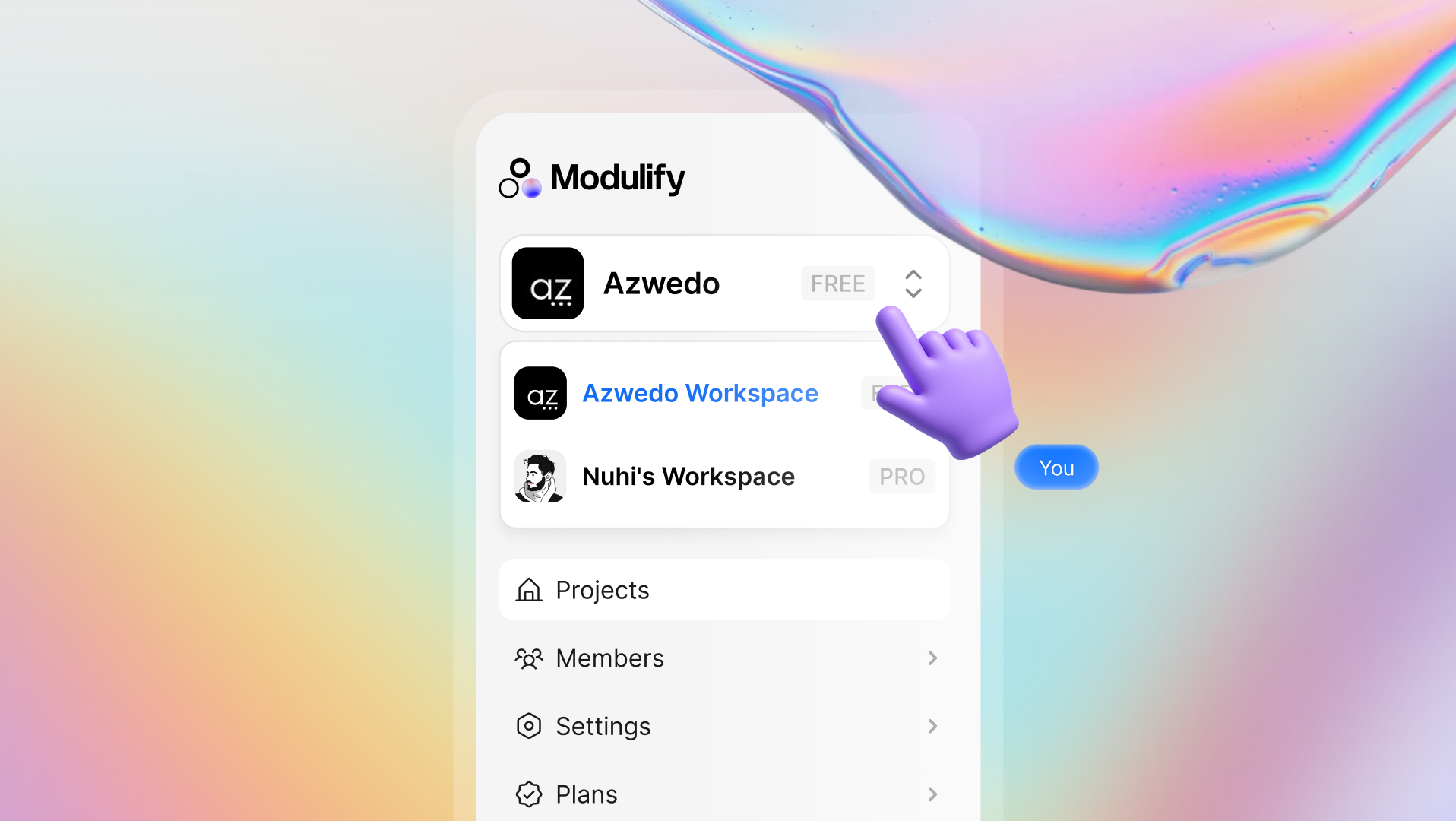
We’re excited to introduce Workspaces, a new way to collaborate for teams in Modulify!
How Workspaces work
Each user has one default workspace, which they own and manage. A workspace owner controls invitations, seats, and billing, and pays for all members in that workspace. Everyone invited joins as a Designer, with access to collaborate but no billing responsibilities.
Users on the Pro plan can invite others into their workspace and manage seats and billing, however, free plan users cannot invite teammates — they can only join workspaces they’re invited to.
If a teammate is removed, their seat becomes an unassigned seat. Unassigned seats can be reused to invite new members without creating additional charges, or removed to reduce seat count on the next billing cycle.
You can’t create multiple workspaces yourself, but you can be invited to multiple workspaces created by others.
Seats follow the Owner's billing cycle (monthly or yearly) and are prorated if added mid-cycle. Workspaces are built to keep collaboration organized, scalable, and easy to manage.
See Workspaces in action:
- Go to the Members tab in your dashboard and click Invite Members
- Enter an email address and confirm the seat purchase
Plan & access notes:
- Workspaces are available on the Pro plan
- Free users can join workspaces but can’t invite others
- Seat removals take effect on the next billing cycle
Workspaces are built to keep collaboration organized, scalable, and easy to manage.
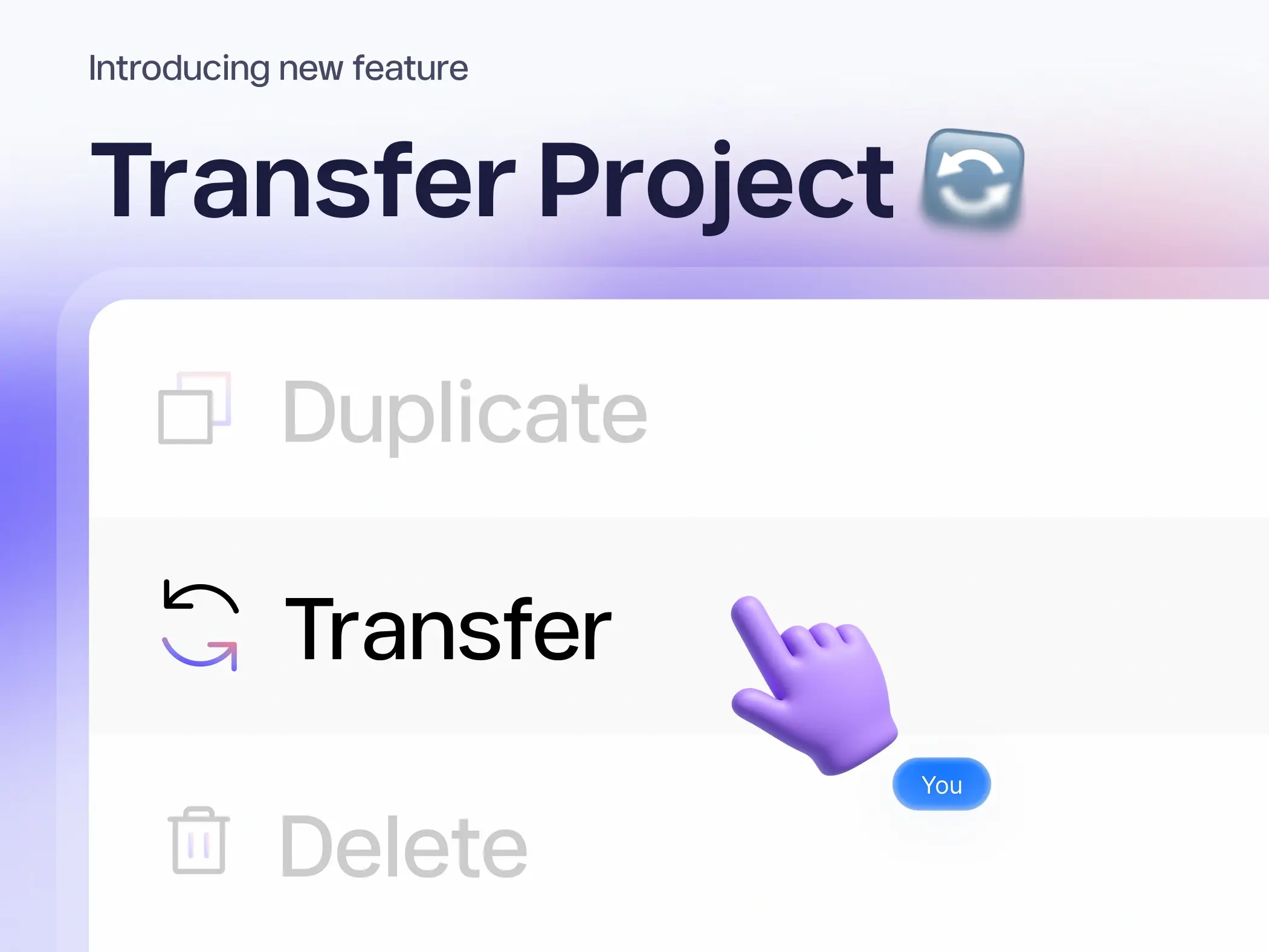
We’re excited to launch Project Transfer, a new Modulify feature designed to make collaboration and project ownership effortless.
Now, designers and collaborators can transfer complete Modulify projects — including all assets, settings, and design permissions — to another user. Once transferred, the new owner gains full control to edit, customize, and continue designing the same project.
The previous owner will no longer have access, ensuring a secure and organized handoff between collaborators, clients, or team members.
Whether you’re delivering a finished client project or handing off to a teammate, Project Transfer keeps your workflow smooth and professional.
How It Works:
- Open your project you want to transfer.
- Click the three dots (⋮) on the project card and select “Transfer.”
- Enter a valid email address of the recipient and click Transfer.
- The recipient will receive an email invitation to accept the project transfer.
- Once they accept the invite, ownership moves to their account — and the project disappears from yours.
Plan & Access Notes:
If a project is transferred from a Starter or Pro plan to a Free plan, the new owner will only be able to edit up to two pages of that project.
To unlock full editing access, you’ll need to upgrade the plan.
Start designing and transfer your projects with ease.
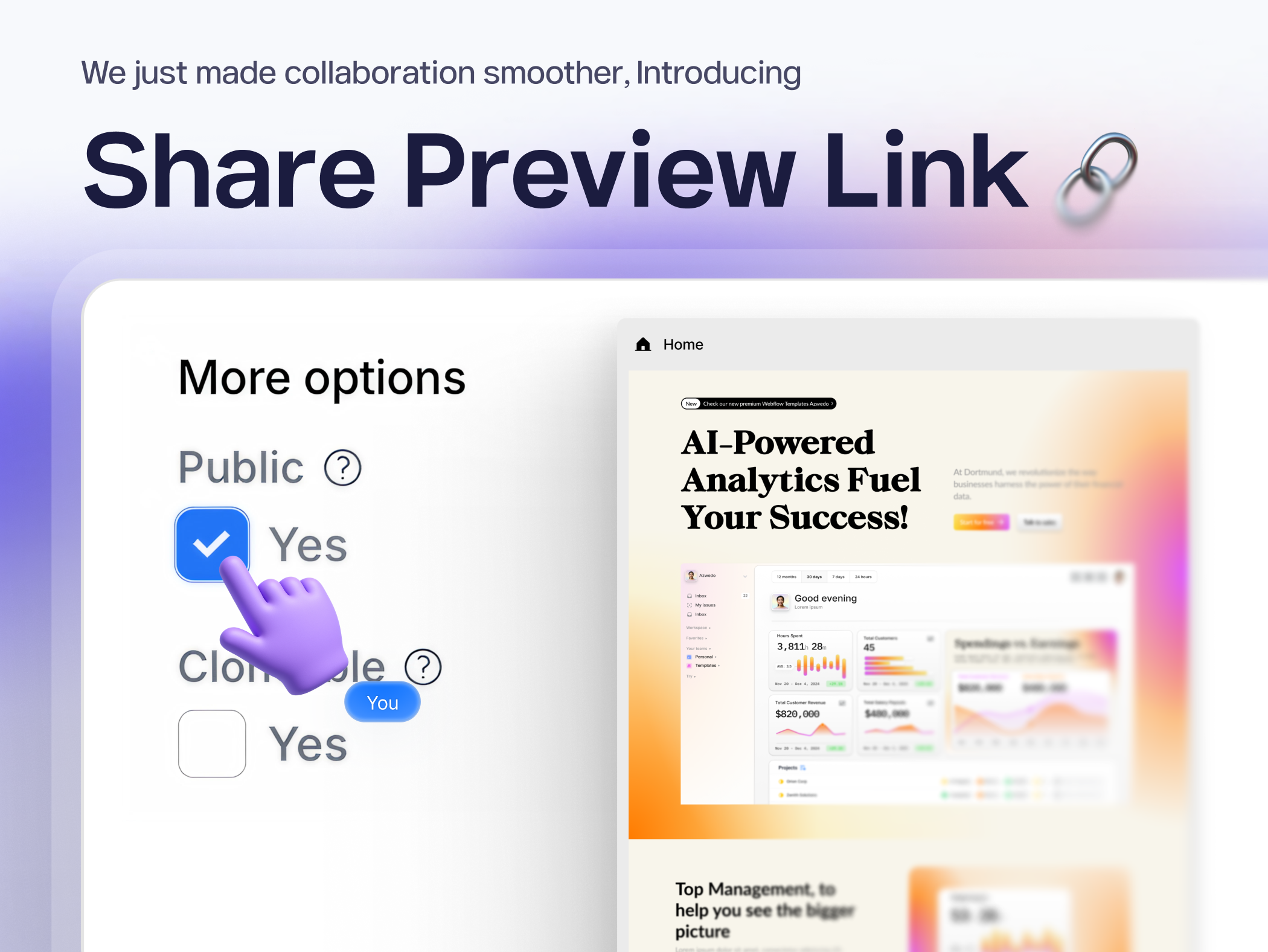
We just made collaboration smoother!
You can now share a live preview link of any Modulify project — allowing clients, teammates, or collaborators to explore your website design in real-time.
Anyone with the link can:
- View your design on desktop, tablet, or mobile
- Zoom in/out to inspect layout details
- Browse the project freely — no login required
This new feature makes it easier to showcase your work, get feedback, or share ideas before publishing to Webflow.
How to Get Your Preview Link
Follow these simple steps:
- Open the project design you want to share.
- On the right panel click Share button
- Turn on the Share preview-only link
- Copy the generated link

That’s it — your Preview Link is ready to share!
Start designing premium designs with Modulify and share your work with others.

Whether you’re creating a property marketplace, an e‑learning platform, a salon website, a wellness blog, a pet‑care shop, or a coffee‑house storefront, these kits offer distinctive color palettes, industry‑specific icons, and layouts that can be dragged and dropped without any coding.
FORM (Hair & Beauty)
FORM is a luxurious design system tailored for hair salons, barbershops and beauty‑service providers. Its warm, muted palette of taupe, blush and soft brown creates an atmosphere of sophistication and comfort. The kit includes custom icons for hairdryers, scissors, combs and other salon tools, alongside elegant imagery placeholders for showcasing hairstyles, staff profiles and before‑and‑after galleries.
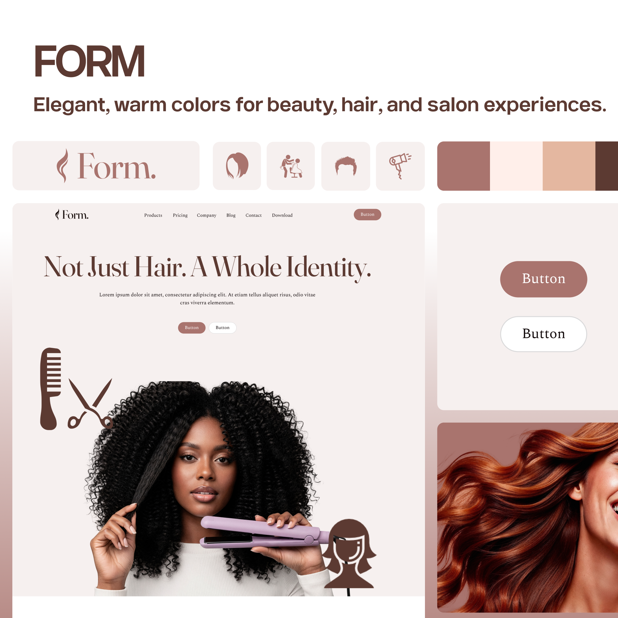
Each component is responsive and can be rearranged effortlessly via drag and drop. Integration with Modulify’s Webflow app means you can import entire projects or individual pages, apply your content, and let the system handle consistent styling and spacing.
Designers do not need to write code or rebuild elements—simply adjust the color tokens and typography to align with your brand. With FORM, building a polished salon website becomes a creative process rather than a technical one, allowing you to highlight your clients’ transformations and reinforce the premium experience you provide.
Greenish
Greenish is crafted for nutrition, clean‑eating and wellness brands that want to evoke freshness and authenticity. The palette uses muted greens, beige and soft neutrals reminiscent of herbs, grains and organic produce. Hand‑drawn icons of fruits, seeds and leaves complement curated photography areas for showing meals, ingredients or lifestyle shots.
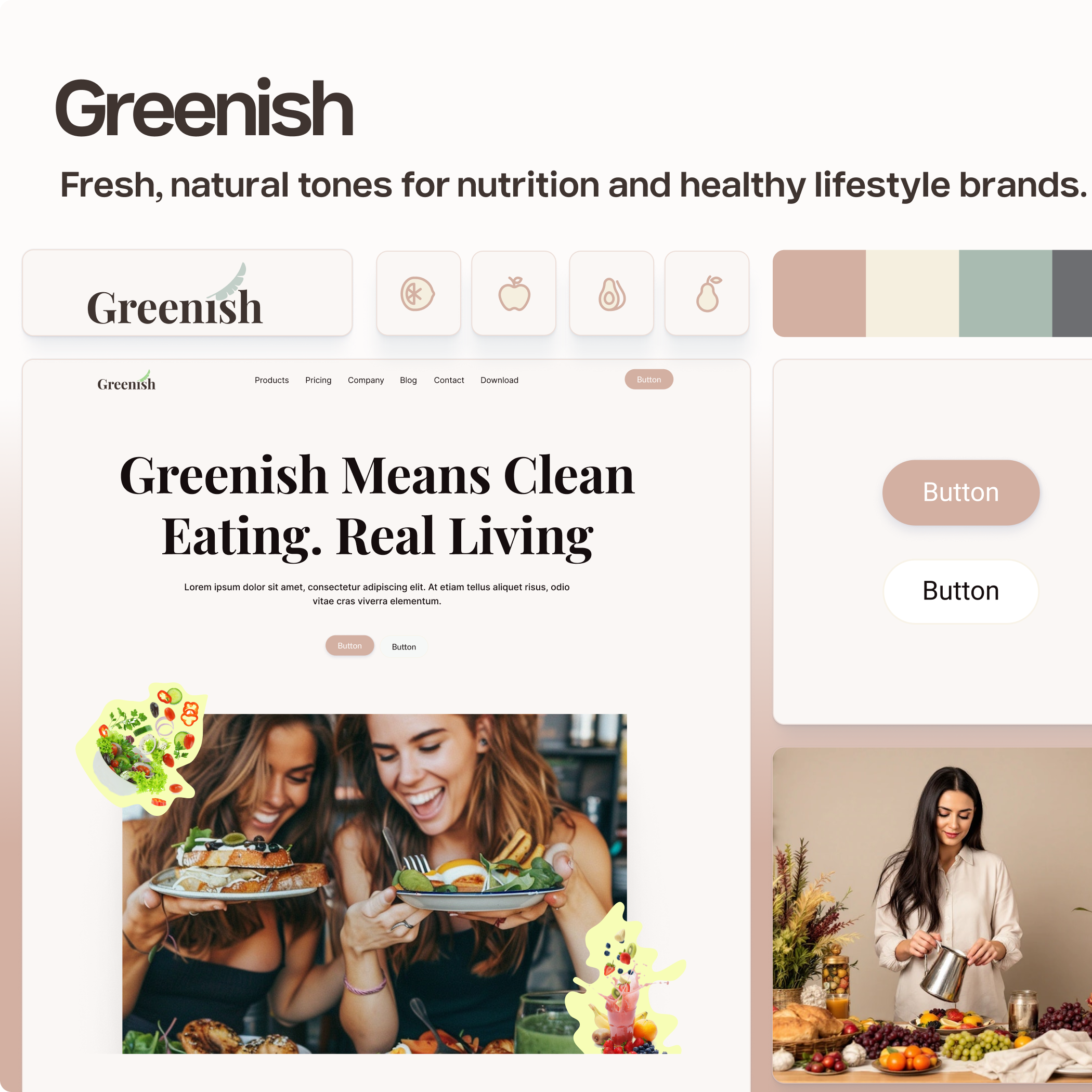
Components cover hero banners, recipe cards, ingredient lists, pricing sections, call‑to‑action areas and newsletter signup forms. Each element is fully responsive and ready for CMS data integration. With Modulify’s drag‑and‑drop Webflow integration, teams can import pages, swap images and text, and sync updates seamlessly.
Greenish empowers designers to build beautiful, credible wellness websites that communicate a clean, natural aesthetic while maintaining high performance and accessibility. It’s ideal for startups, dieticians, healthy food delivery services or lifestyle blogs looking to stand out with a cohesive, nature‑inspired look.
CourseLab
CourseLab provides a modern, uplifting design language for educational platforms, coaching services and e‑learning products. A gentle pastel foundation is paired with vibrant accent hues such as orange, purple and royal blue to keep users engaged.
Custom icons depict lectures, digital classrooms and achievement badges, while illustrated characters lend warmth and personality. Like all Modulify systems, CourseLab includes more than 1,200 responsive components that adhere to the Client‑First framework.

Designers have access to ready‑made blocks for hero sections, curriculum overviews, course cards, pricing tables, signup forms, blog articles and footers. Each module is fully responsive, accessible and structured to accommodate dynamic CMS data.
No coding is required—simply drag and drop elements within Webflow. Because CourseLab syncs directly with Modulify’s app, you can import new pages, update text and images, and keep your design system consistent with one click.
This makes it easy to build scalable educational websites or membership portals that feel friendly, professional and future‑oriented. Whether you’re building a site for a university, bootcamp or personal coaching brand, CourseLab streamlines production while providing an on‑brand look and feel.
Mocha
Mocha is a coffee‑inspired design system ideal for cafés, roasteries, beverage brands and lifestyle blogs centred around warm comfort. The palette features rich shades of espresso, caramel and golden honey, creating a cozy ambience reminiscent of a coffee shop interior. Complementary icons illustrate cups, beans and brewing equipment; stylised illustrations add artisanal character.
Each component is fully responsive, with mindful white space and typography that balance modern minimalism with rustic charm.
Designers can drag and drop modules in Webflow, connect them to dynamic CMS collections and maintain a consistent style across pages. The Modulify integration lets you import or export entire projects, keep content in sync and update design tokens at scale.
Whether you’re launching an online shop for coffee beans, promoting a local café or writing about brewing techniques, Mocha offers a cohesive visual language and an expansive library of components to accelerate your build while capturing the essence of coffee culture.
Casa / Real Estate
Casa is a comprehensive design system purpose‑built for real estate and property‑service websites. It uses a professional palette dominated by deep blues, neutrals and bright accent colors to communicate trust, reliability and a modern outlook. The system includes tailored icons for houses, buildings and keys, plus image placeholders sized for property listings, agent profiles and call‑to‑action banners.
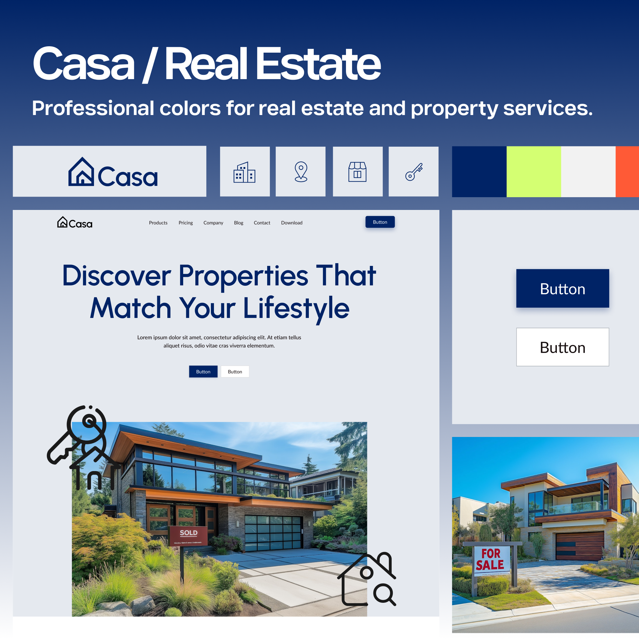
Under the hood, Casa contains more than 1,200 responsive components covering everything from hero sections and property grids to map overlays, search bars, testimonial sliders and contact forms. Designers can mix and match these modules to craft custom pages without writing code.
Because it follows the Client‑First style guide, every class, variable and section remains clear and reusable; updates to typography or colors cascade across the project effortlessly.
With drag‑and‑drop editing through Modulify’s Webflow integration, you can import single pages or entire projects, apply your own branding and sync updates with one click.Casa makes it easy to build feature‑rich real‑estate sites that feel polished and trustworthy—ideal for agencies, brokers, or platforms showcasing listings and services.
Misa
Misa is a friendly and playful design system designed for pet stores, animal charities and other pet‑focused businesses. A sky‑blue base is combined with cheerful accent colors like pink, mustard and lilac, conveying warmth and fun. Icons depict paws, toys, bowls and grooming tools, while generous image blocks allow you to feature pets in action.
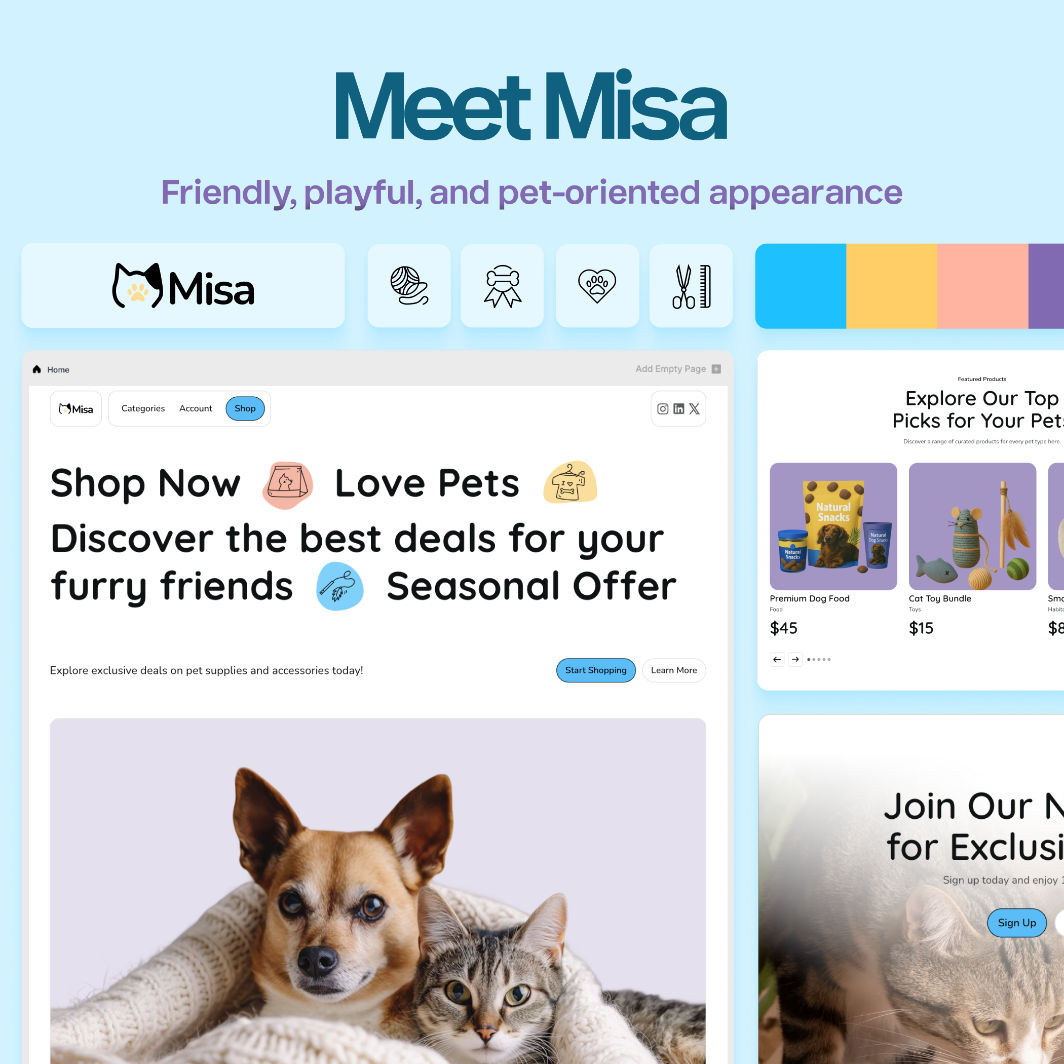
Buttons are rounded and expressive, often paired with emojis or illustrations to enhance the playful tone. Misa’s components integrate seamlessly with Webflow’s e‑commerce features—drag and drop to build carts, checkout pages or membership portals. Because everything syncs via Modulify, updates in colors, fonts or spacing propagate across your project.
With no coding required, designers can quickly assemble a pet‑friendly site that feels trustworthy, modern and engaging. Misa is perfect for brands selling pet supplies, promoting adoption programs or running community events—anywhere that a joyful, pet‑centric experience matters.
Explore other design systems that fit your needs and start designing hassle free with Modulify.
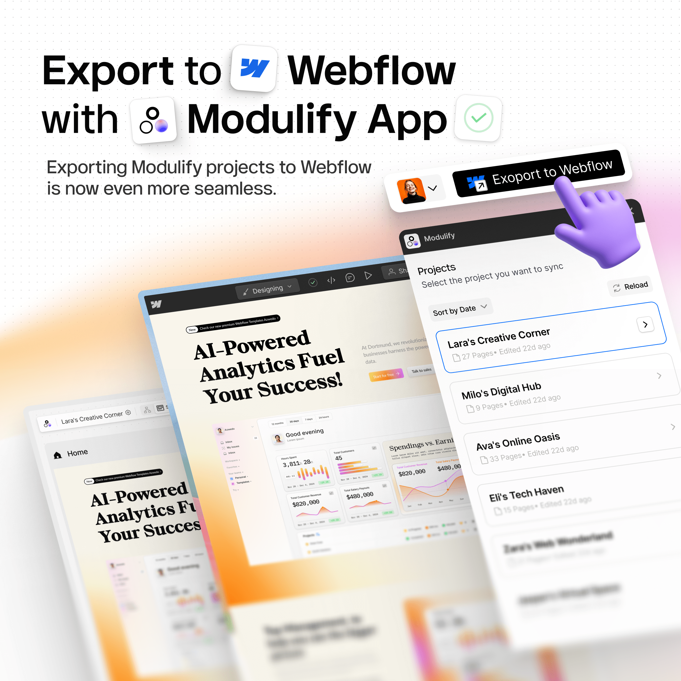
We’re excited to announce that Modulify is now available as a Webflow App, making your workflow faster and more effortless than ever.
With the app, you can:
- Import designs directly into Webflow – bring over full projects or just the specific pages you need.
- Stay in Client-First style – all imports are structured cleanly within the Client-First framework.
- Sync styles and variables in one click – typography, colors, images, and global styles carry over instantly.
- Mix & match pages with ease – combine multiple Modulify pages into your existing Webflow projects without breaking consistency.
- Save hours of setup – no more manual copy-paste of layouts, classes, or content.
The Modulify Webflow App is built to keep you in flow, so you can focus less on setup and more on creating meaningful design.
Get the Modulify App!
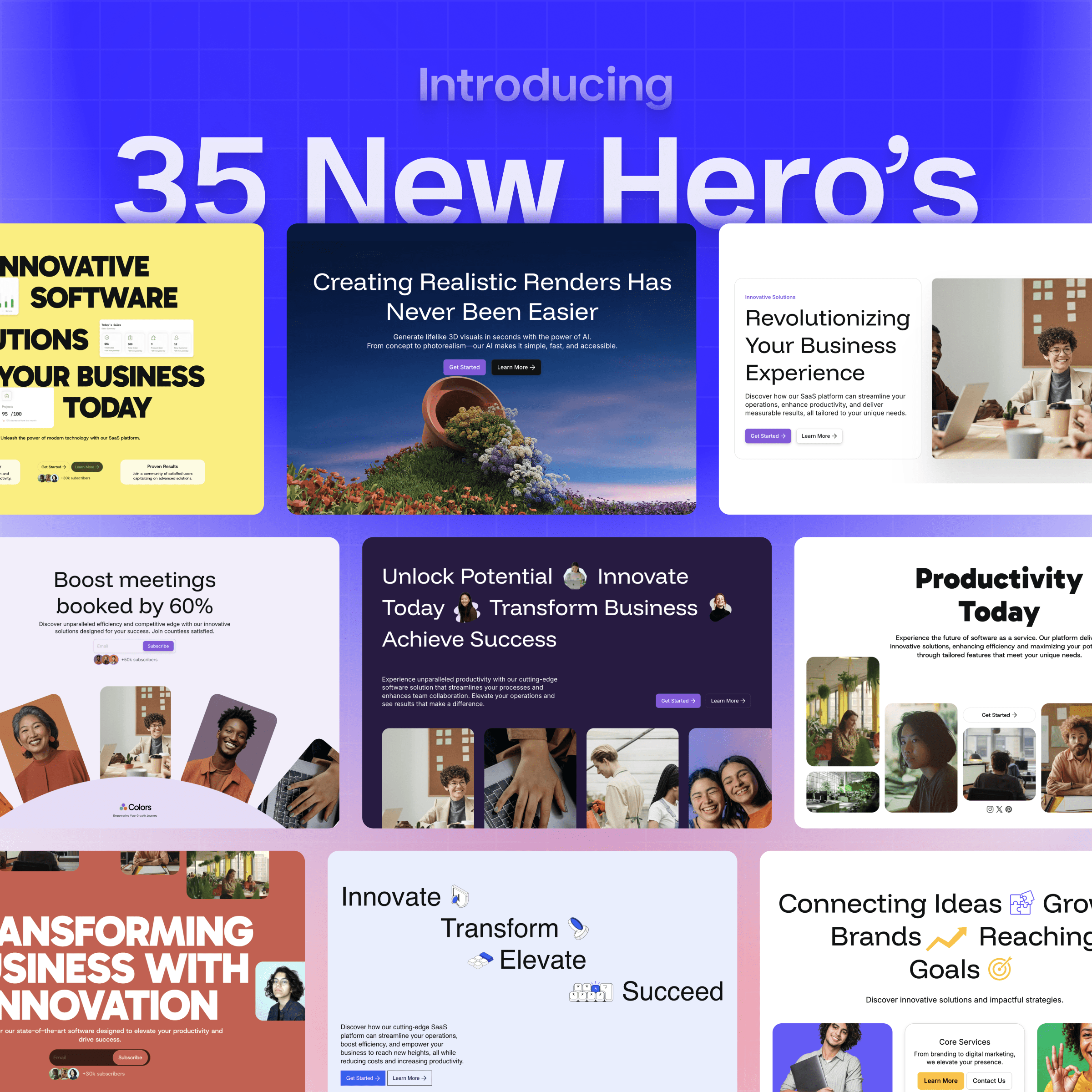
New components, new designs
Whether you're building a SaaS landing page, a personal portfolio, an agency site, or an eCommerce brand, your hero section is the first (and often only) chance to make an impression. That's why every new hero layout in Modulify is strategically designed to grab attention, communicate value fast, and guide visitors toward action.
These aren't just visually appealing blocks. Each hero is tailored by category, with thoughtful content structures and design patterns that match the user intent of different industries.
Here’s what you can expect:
- SaaS Heroes with bold headlines, feature highlights, and crisp CTAs that are built for high-conversion above the fold.
- Portfolio Heroes that let your work speak for itself — with clean imagery, personal intros, and elegant typography to showcase your voice and value.
- Agency & Studio Heroes that create instant trust and showcase brand confidence with dynamic layouts, trust signals, and animation-ready elements.
- E-commerce & Product Heroes designed to spotlight a product, offer, or collection with bold visuals and conversion-focused copy blocks.
- Minimal & Editorial Heroes for those looking to keep it clean, storytelling-driven, and visually premium.
All hero components are fully editable — you can customize the color palette, swap typography, update copy, and adjust spacing directly in the Modulify interface. Better yet, they're ready to export directly to Webflow with Client-First structure baked in, making implementation seamless for both no-code creators and devs.
Component Responsivnes
Each layout has been user-tested for clarity, hierarchy, and responsiveness, so they perform just as well on mobile as they do on desktop. Whether you want a hero with layered visuals, side-by-side CTAs, social proof, or minimalist focus — we’ve got you covered.
To make your workflow even faster, every hero section is also paired with AI-generated placeholder content tailored to the section’s theme, helping you speed past the blank canvas and into real design in seconds.
So whether you're starting a new project from scratch or just looking to refresh an existing homepage, Modulify now gives you more ways to captivate visitors and convert them into action — right from the very top of your site.
Ready to launch with impact?
Explore the new hero components inside Modulify today.
Meet the New Modulify – Fresh Look, Better Flow
August 4, 2025
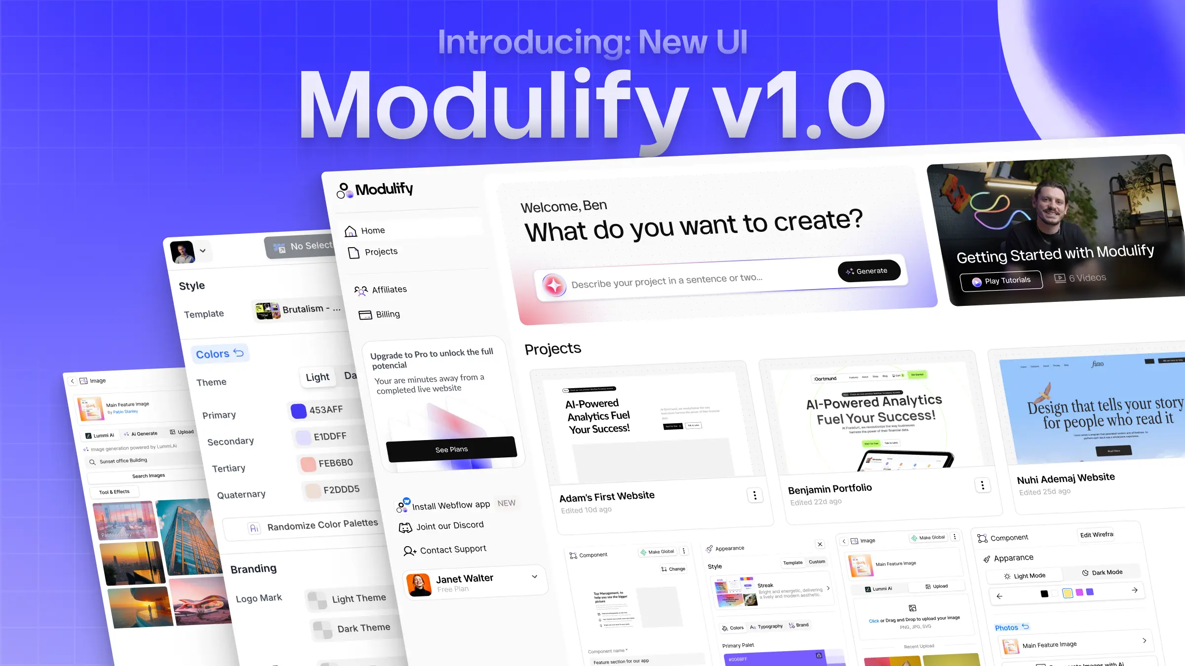
Introducing Our New UI
From the beginning, our goal has been to simplify the way designers, developers, and creators build websites. With this latest update, we’ve taken that promise even further. Every corner of the Modulify app has been refined for usability, visual clarity, and performance—from the welcome screen to how you manage your colors, branding, layouts, and projects.
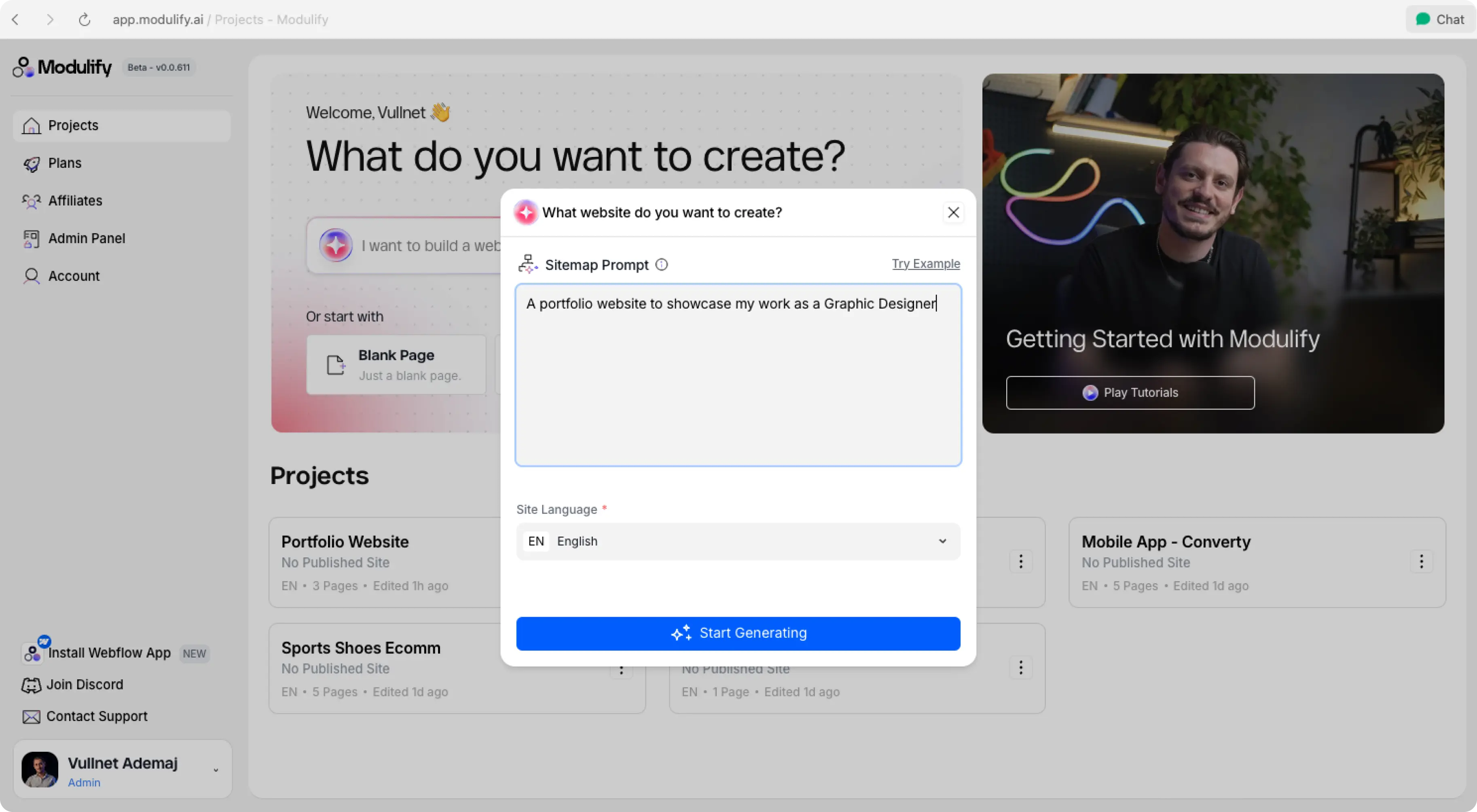
A Welcome Screen That Gets You Moving
Right from the start, the new dashboard invites you in with a clear prompt: What do you want to create? Whether you’re starting from a blank canvas or importing an existing site, we’ve made sure you can get going in seconds. You’ll also find easier access to video tutorials, past projects, and quick tools—so you never waste time figuring things out.
Smarter Design Panel & Sidebar
The new sidebar layout is more structured and responsive, with a streamlined experience for editing templates, switching between light/dark themes, and making real-time changes to colors or images. We've labeled key UI zones like Structure, Design, and Responsiveness to give you more control and confidence when navigating across different device views.
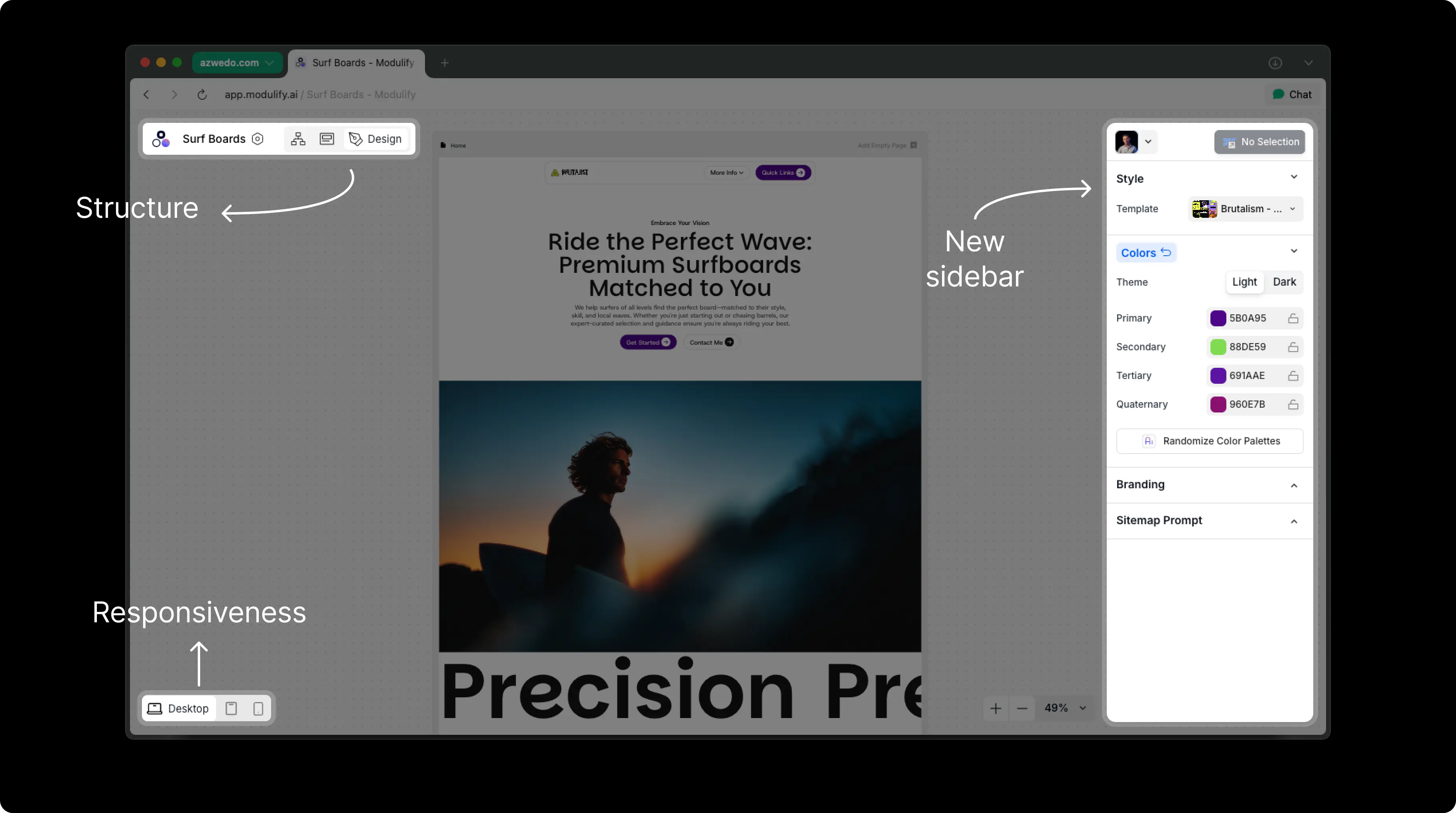
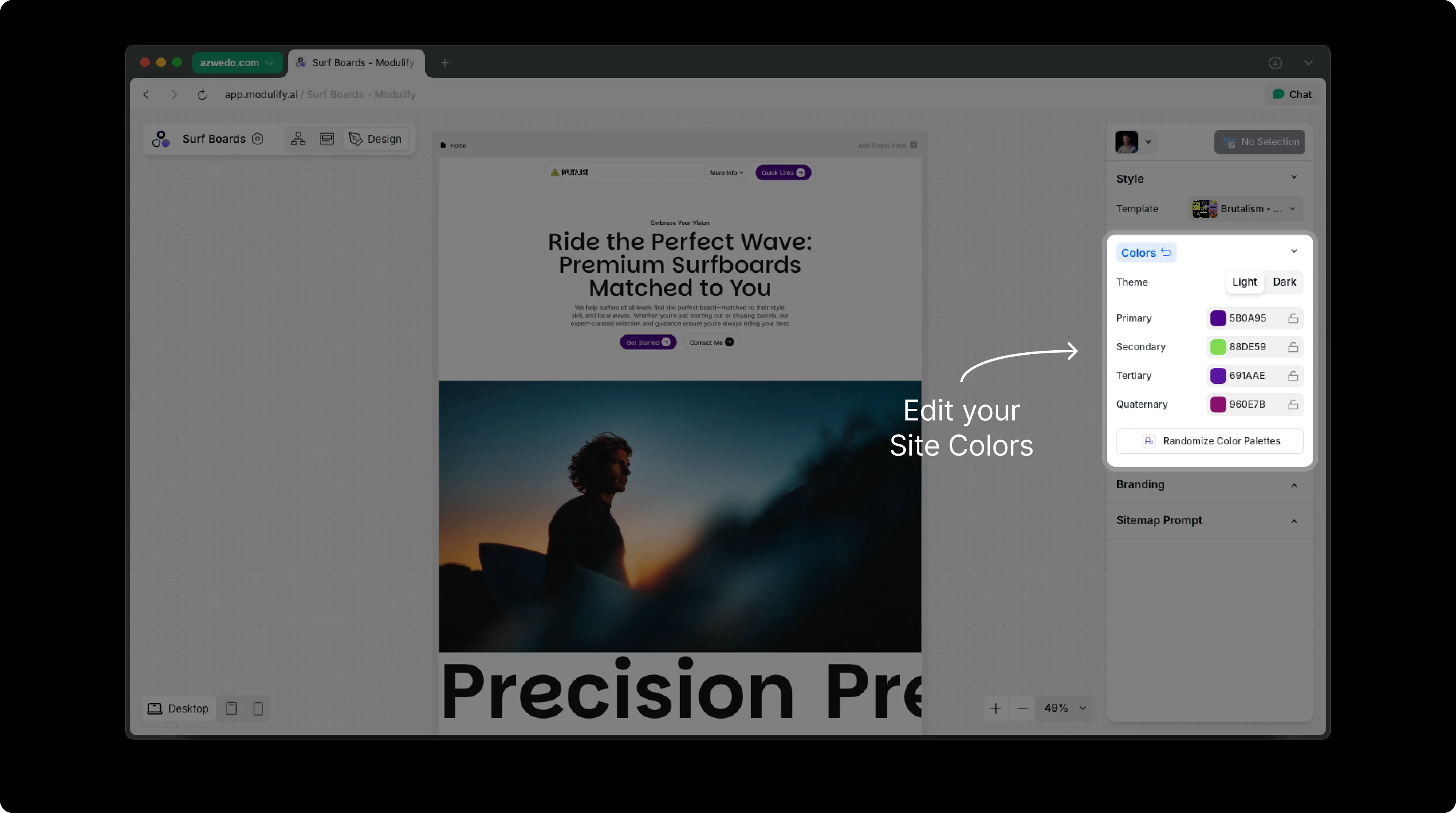
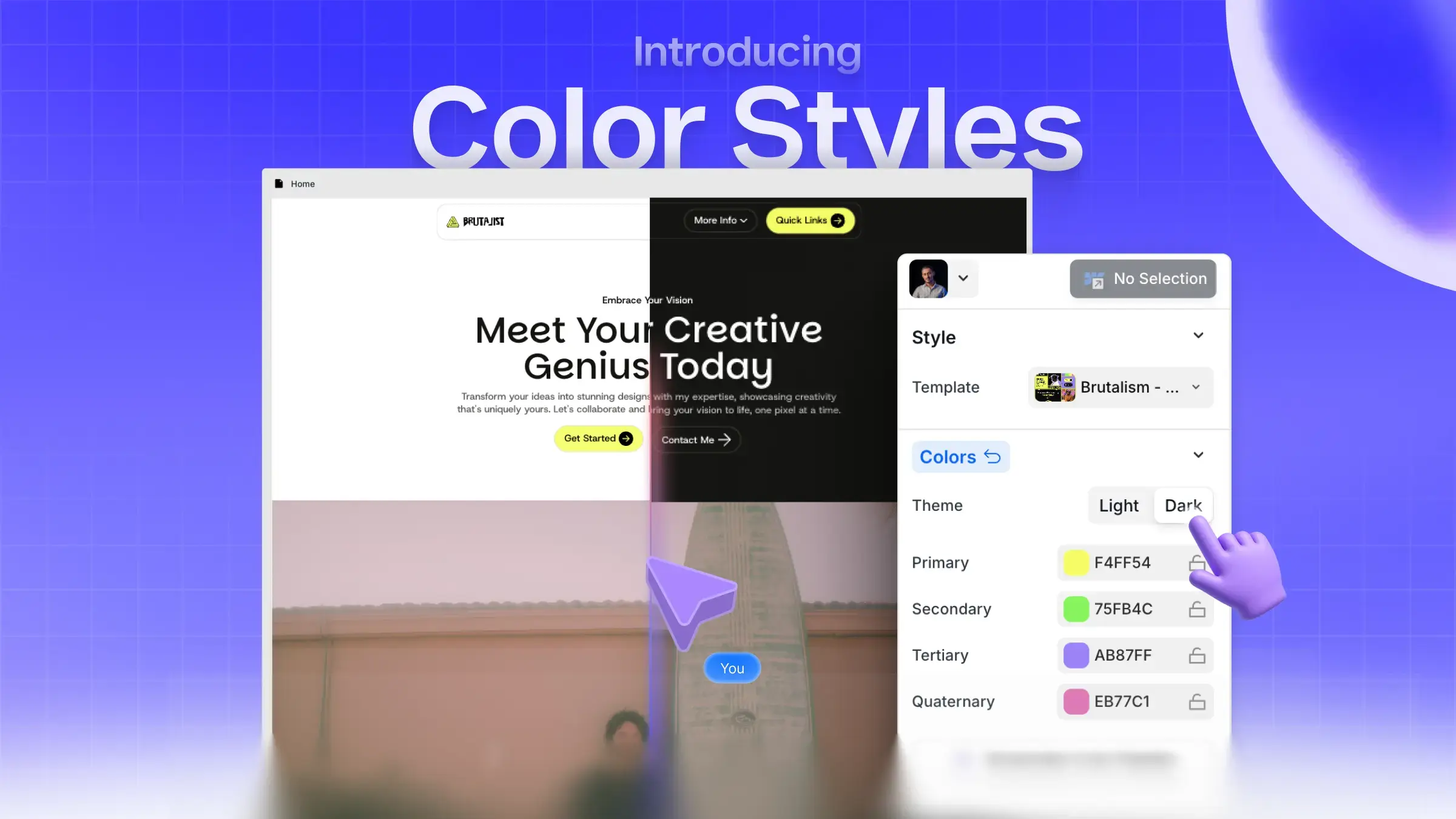
Total Color Customization
One of the biggest updates is the ability to fully customize your design system colors. You can now edit and preview your Primary, Secondary, Tertiary, and Quaternary colors directly from the sidebar. Want inspiration? Use our “Randomize Color Palettes” feature to discover unexpected combinations that work beautifully. Learn more.
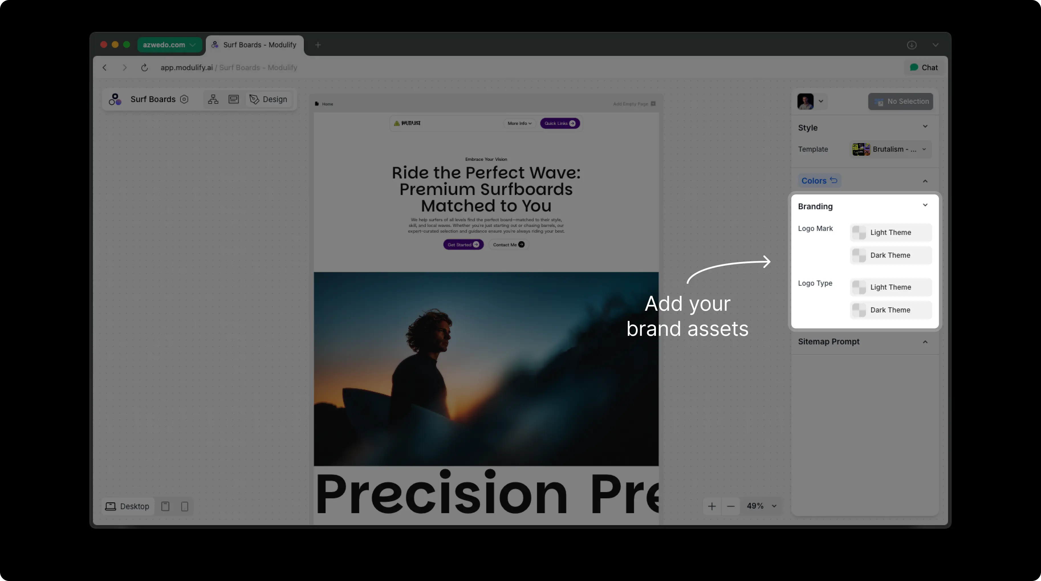
Add Your Brand, Your Way
We've also introduced a new Branding section that lets you upload and manage logo variations (light/dark theme) and other identity assets with ease. This makes it easier to stay on-brand across every page or project you create, whether you’re building for yourself or a client.
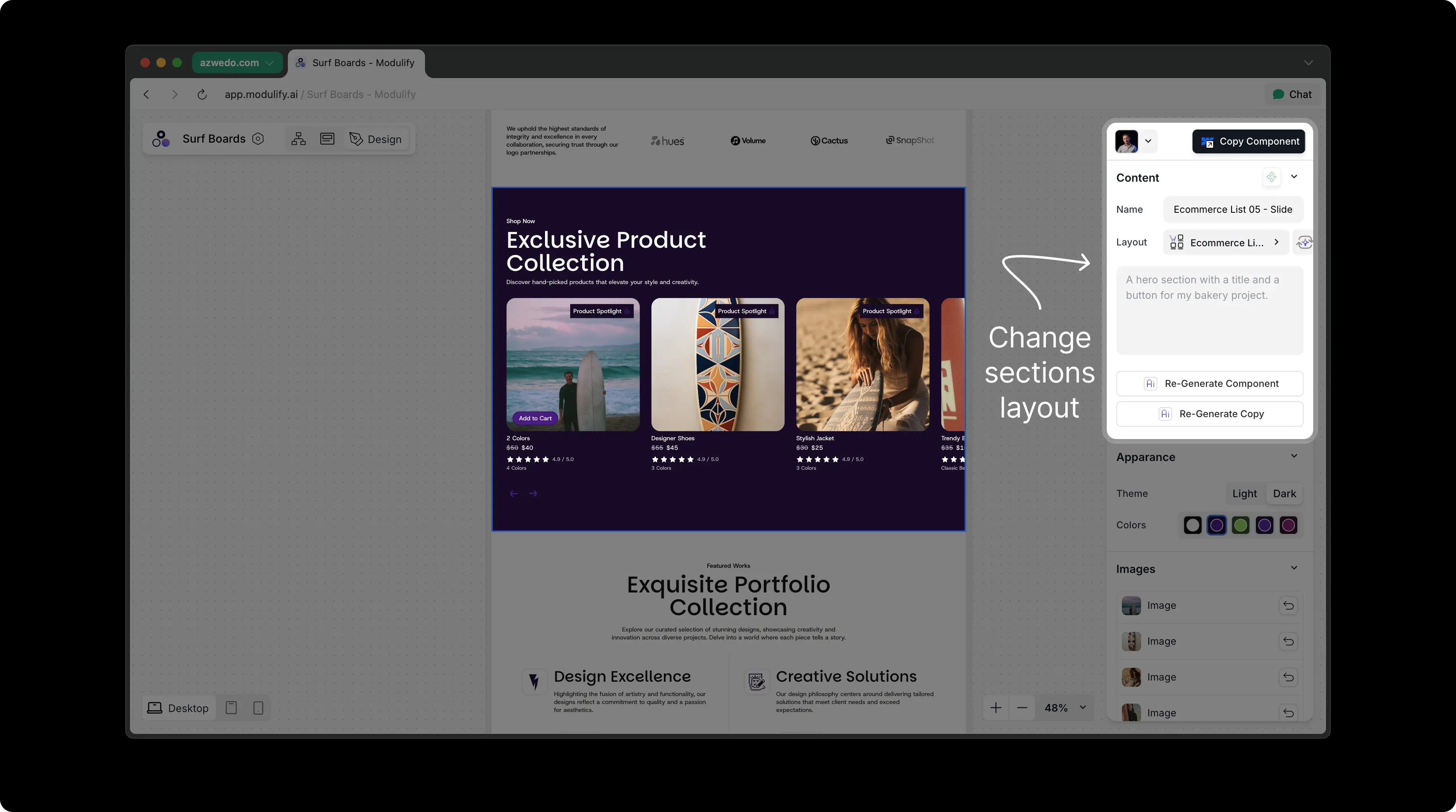
Dynamic Component Control
Need to switch the layout of a section or refresh the content? The new component manager lets you instantly regenerate both the layout and copy with just one click. This gives you more flexibility to iterate and explore ideas quickly without starting from scratch.
This UI update is more than just a visual refresh—it’s a usability evolution. It brings you closer to the result with less friction, smarter defaults, and more room to personalize every detail. Whether you're designing solo or collaborating across teams, Modulify now adapts better to the way you work.
We’re continuously improving and can’t wait to hear what you think. Log in and explore the new version today!
Modulify just unlocked a whole new layer of creative freedom. Starting today every component in our library ships with a fully editable colour panel that lives right inside the canvas.
Enhanced Flexibility for Your Design Goals
Flip between Light and Dark themes with a single click, then dial-in Primary, Secondary, Tertiary, and Quaternary hues to echo your brand—right down to the hex.
.webp)
With our latest update, you can effortlessly change and manage color palettes directly within your Modulify design system. This gives designers unparalleled flexibility, allowing you to adjust individual colors, apply global palettes, and ensure every design aligns seamlessly with your brand vision.
Customize Every Section Effortlessly
Now, you can easily customize colors for individual components, sections, or entire pages—all with just a few clicks. Modulify's intuitive color editing tools make it simple for anyone, from seasoned Webflow experts to no-code creators, to quickly experiment and see immediate results. Your customized sections will maintain visual consistency across your project, dramatically speeding up your workflow.
.webp)
Randomize Color Palettes
And for the moments when inspiration stalls, we’ve taught Modulify’s in-house AI to play art director. Tap “Randomize Color Palettes” and the algorithm generates curated combinations engineered for modern UI trends: high-contrast neutrals for fintech dashboards, muted earth tones for wellness brands, or punchy gradients for landing pages that need to pop.
.webp)
Built for Your Brand, Optimized for Flexibility
With this enhanced color-editing feature, Modulify not only simplifies your design process but also amplifies your creative freedom. You can confidently build projects knowing you have total control over your design system's appearance. Create, adjust, and refine until your brand’s style is perfectly captured, all without ever leaving the Modulify environment.
.webp)
Your designs, your colors—fully customizable to meet your exact design goals.
Start building the site you’ve long dreamed of!

After many requests from the Webflow community, we are excited to announce that all Modulify components are now available, built with the Client-First style. This integration brings enhanced clarity and consistency, providing even more value to our community.
What is Client-First?
Client-First is a structured CSS class naming convention and methodology created by Finsweet, designed specifically to build scalable and easily maintainable websites on Webflow. It emphasizes clarity, organization, and simplicity, empowering both developers and clients to manage their Webflow projects effectively.
Client-First Goals — What Does this Style Aims to Achieve:
- Universal readability: Every class name is self-explanatory, ensuring any designer, developer, or client can open a Webflow project and instantly understand its structure.
- Speedy hand-off & onboarding: Shared naming conventions and logical folder structures dramatically reduce the time needed to onboard new collaborators (or your future self).
- Scalable architecture: From small marketing sites to complex, multi-page web apps—projects grow seamlessly from the same foundation without class bloat or style conflicts.
- Consistent styling at scale: Global tokens (e.g., color-primary, padding-large) and utility classes enforce consistency in spacing, color, and typography.
- Reduced technical debt: Predictable patterns minimize the need for quick fixes that accumulate into messy CSS over time.
- Effortless maintenance: Standardized folders, attributes, and combo-class rules simplify locating and adjusting elements in the future.
- Client empowerment: Non-technical stakeholders can confidently edit content, add sections, or update CMS items without risking layout issues.
- Community compatibility: By aligning with widely-adopted Webflow conventions, your projects easily integrate with popular clonables, tutorials, and third-party tools.
What to Expect:
- Quick familiarization with your project's structure.
- Simplified collaboration and fewer misunderstandings within teams.
- Faster development times due to reusable classes and predefined layouts.
- A standardized, professional-quality Webflow project ready for client delivery or additional customization.
Why Does the Webflow Community Widely Use Client-First?
The Client-First style gained popularity in the Webflow community because it:
- Significantly simplifies project management, updates, and team collaboration.
- Ensures consistent, professional-quality results.
- Reduces development time through reusable classes and predefined structures.
- Facilitates onboarding and training of new team members or clients.
- Improves overall website performance and maintainability.
Using Client-First with Modulify ensures your Webflow projects are well structured, easy to navigate and maintain. With CF framework your website has strong foundation for future scale and growth.
For additional information regarding the Client-First framework, follow this link.

Pearl is our newest design system tailored for creators in the jewelry, beauty, and luxury lifestyle space. Whether you're launching a boutique e-commerce brand or building an editorial-style showcase, Pearl offers the tools you need to express elegance and refinement with ease.
Built around striking serif fonts, high-end imagery, and editorial layouts, Pearl strikes the perfect balance between modern UX standards and timeless aesthetics. The design system uses soft lavender and neutral tones to create a calming yet premium visual identity—perfect for showcasing delicate products or luxurious content.
From elegant hero sections to curated product grids and stylized call-to-actions, Pearl empowers designers to create high-converting, visually stunning websites without starting from scratch. Build confidence with every scroll, and let your brand shine like the gem it is—with Pearl.
Start building your future site and shine!

Image Uploads & AI Tools
Bringing your vision to life now happens even faster. Here’s what’s new in image customization:
- Upload your own images directly into your wireframes
- Choose from Lummi’s premium visuals — Photos, 3D renders, and Artistic illustrations
- Generate and edit images with AI to match your exact needs and creative direction
This update gives you unmatched flexibility, whether you're working with your brand assets or exploring something fresh with AI.
Icon Magic with Ikonik
Modulify now lets you fully control how your site communicates—down to the tiniest icon:
- Swap and customize icons instantly
- Access 50,000+ icons from the Ikonik collection (fully editable SVGs)
- Upload your own icons, with AI icon generation coming soon
More style, more control, and more ways to express your brand visually—effortlessly.

Your logo, your style, customize instantly.
Bringing your (or your client’s) brand to life in Modulify just got easier. You can now upload your brand logo, icon, and custom color palette directly into the platform.
From the moment you start a project, your brand assets are applied across components and layouts — keeping everything consistent and professional.
Try it now and create beautifully branded websites, effortlessly.

Power up your online store
Design high-converting online stores faster than ever. With +23 new eCommerce components — including product listings, cart sections, and checkout flows — Modulify gives you everything you need to build stunning eCommerce experiences in minutes.
These prebuilt sections are optimized for usability, conversions, and seamless integration into any design system.
Start designing smarter eCommerce sites today with Modulify’s newest component update!

Design System for SaaS – Radius
Radius is a powerful design system crafted specifically for SaaS and tech agencies.
With sleek, modern design elements and a focus on user experience, it helps you create intuitive, efficient websites that drive productivity.
Tailored to meet the needs of fast-paced, tech-driven businesses, Radius ensures your projects stand out with precision and innovation.
Start designing your next SaaS website with Modulify!

Design System for Real-estate – Grandora
Grandora is a sophisticated design system created for high-end hospitality and real estate.
With refined aesthetics and a focus on luxury, it empowers you to craft elegant websites that exude professionalism and class.
Perfect for showcasing premium properties and exclusive services, Grandora elevates your online presence with style and sophistication.
Building a Webflow website for real-estate has never been easier. Start exploring Modulify and get amazed with features and possibilities.

Design System for Wellnes – Alora
Alora is a serene design system crafted for wellness, skincare, and lifestyle brands. With warm tones and minimal aesthetics, it creates a luxurious, calming experience.
Perfect for showcasing premium products and services with elegance and ease.
Try Alora design system and personalize your site with your products for maximal conversion.

Introducing our new DS for Law Firms – ProLaw
Build trust and professionalism effortlessly with ProLaw, our new design system crafted specifically for law offices, attorneys, and legal consultants.
Featuring elegant typography, structured layouts, and a refined navy & gold color palette, ProLaw ensures credibility and sophistication in every detail.
Start designing with ProLaw in Modulify today and create law firm websites that exude confidence and authority!

Bora — Our New Design System for Cleaning Businesses is here.
Need a spotless, professional website for your cleaning business?
Bora is here to help you shine! Designed with cleaning services in mind, Bora combines bright, fresh layouts with a clean, polished aesthetic that perfectly reflects your brand's commitment to excellence.
With crisp, easy-to-read typography and soft blue tones, Bora offers a welcoming and polished feel that builds trust with your clients.
Pre-built sections for services, pricing, and customer reviews make it effortless to highlight your business offerings and showcase your customer satisfaction.
Transform your website with Bora and create a professional online presence that leaves a lasting impression.
Start building with Bora today!

Go Global with Modulify!
Start creating your way—now in any language!
Modulify empowers you to design premium websites and launch them in over 100 languages worldwide.
Reach new audiences, expand your brand, and make an impact across borders with seamless multilingual websites.

Modulify is now live in Beta! 🚀
We're excited to bring you an AI-powered platform that simplifies website design, making it easier to create and launch in Webflow.
Your feedback is invaluable—explore, design, and let us know how we can make Modulify even better!

The AI builder for polished landing pages, websites, and web apps — powered by curated sections, design systems, and AI editing.
